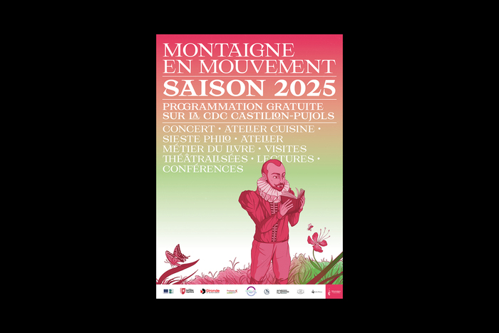
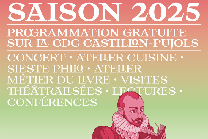
Montaigne en mouvement(“Montaigne on the move”) is a recurring festival organised by the Association Montaigne, aiming to promote architectural and literary heritage. This year, the event focuses on philosophy in the garden (the event is held in the castle of philosopherMichel de Montaigne), which inspired the theme of the illustration.
Hyperion's nested glyphs and discretionary ligatures create a scholarly playfulness that perfectly captures Montaigne's humanist philosophy—intellectual rigor without academic stuffiness. The typeface's dynamic form model, with its open apertures and calligraphic underpinnings, evokes the flowing movement of philosophical discourse while maintaining the gravitas needed for a literary heritage festival. This is typography that thinks while it breathes, mirroring the contemplative yet vital spirit of philosophy in the garden.
Hyperion's dynamic form model serves this philosophical festival brilliantly—the open apertures and diagonal stress echo the organic, conversational nature of Montaigne's essays while the nested glyphs create visual metaphors for layered philosophical thinking. The typeface's calligraphic roots connect to the literary manuscript tradition, while its contemporary ligatures and nested characters allow for the kind of typographic play that reflects the festival's "movement" concept. The all-caps treatment transforms the inherently warm dynamic forms into monumental statements worthy of architectural heritage.
As a single-font system, Hyperion's extensive character set and nested glyph features create internal hierarchy through typographic texture rather than traditional weight changes. The discretionary ligatures and nested glyphs function almost like a second voice within the same typeface—maintaining perfect structural unity while offering dramatic variations in visual density and complexity. This approach mirrors philosophical discourse itself: one voice exploring multiple layers of meaning.