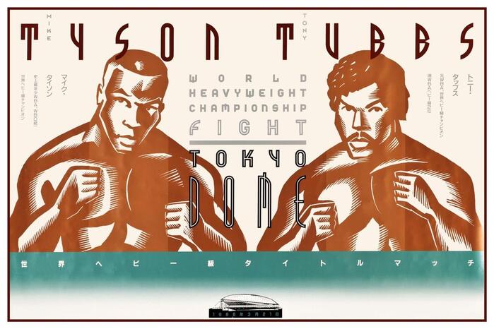
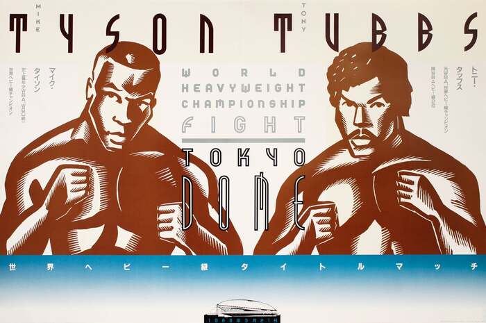
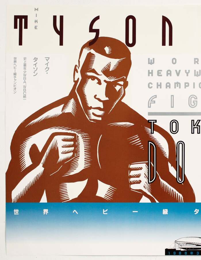
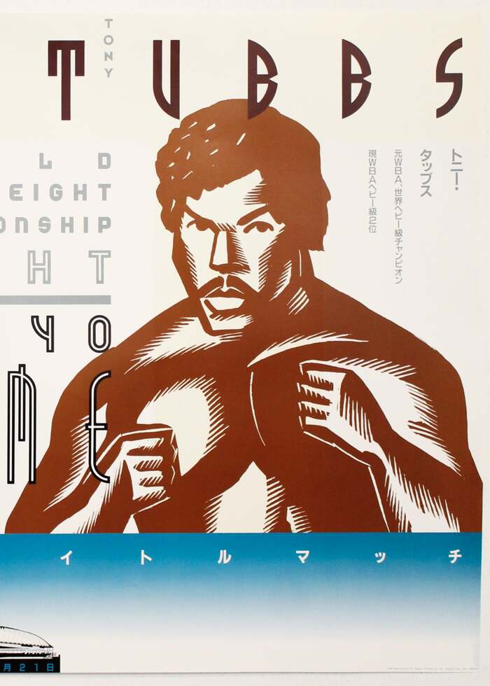
A poster promoting theMike Tyson vs. Tony Tubbs world heavyweight championship boxing matchon 21 March, 1988 at the then newly-openedTokyo Dome. It was designed byJohn C. Jay, with English-language typography by Neville Brody and portraits by Anthony Russo. The poster features the initial versions of what would later become the fontsFF Tyson,FF World,FF TokyoandFF Dome. The Japanese text usesGona. Official reissue from the collectionThe 100 Best Posters from Europe and the United States 1945–1990 (1994) A 1993 poster recreating the typography of the 1988 poster for the release of the fonts by FontShop
This typography system channels industrial-futurist spectacle through aggressive geometric construction and monumental weight distribution. The custom fonts embody heavyweight authority via ultra-bold proportions and architectural solidity, while their geometric form model creates technological precision that transforms boxing into a space-age spectacle. The bilingual execution demonstrates how rational geometry can transcend cultural boundaries while maintaining brutal impact.
The custom geometric fonts operate on pure constructed logic—circular forms, uniform stroke weights, and systematic modularity that echoes the Tokyo Dome's architectural geometry. Their extreme weight and condensed proportions create maximum impact within poster constraints, while the consistent geometric form model across all Latin fonts (Tyson, World, Tokyo, Dome) ensures systematic cohesion despite varied applications. The pairing with Gona for Japanese text maintains geometric clarity while respecting Japanese typographic traditions, creating bilingual harmony through shared structural DNA.
The Latin fonts share an identical geometric form model with systematic construction principles, creating perfect structural harmony across the font family. Each variant serves hierarchy through weight and width modulation rather than contrasting form models—classic Kupferschmid harmony principle. The Japanese Gona maintains the geometric clarity and weight presence needed to match the Latin fonts' impact, ensuring the bilingual layout reads as a unified system rather than competing typographic voices.