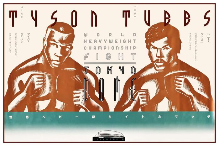
FF Tyson operates from a geometric skeleton with constructed letterforms that prioritize impact over subtlety. Its stroke weight is deliberately heavy with minimal contrast, creating letters that function more as graphic elements than text carriers. The apertures are narrow and counters compressed, following the logic of condensed display faces designed to maximize character count in tight horizontal spaces. This is clearly display-only DNA—built for headlines that need to shout rather than whisper. The typeface belongs to the tradition of industrial sans serifs that emerged in the mid-20th century, designed for maximum visibility at large sizes rather than reading comfort. Its personality is assertive and utilitarian, bringing a no-nonsense authority to headlines while completely abandoning any pretense of text readability.