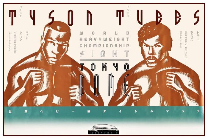
FF Dome
FF Dome is built on a rational skeleton with closed apertures, vertical stress, and systematic proportions that create an orderly, authoritative presence. The letterforms exhibit low stroke contrast with nearly uniform weights throughout, characteristic of the grotesk tradition. Its closed apertures in letters like 'e' and 'a', combined with relatively narrow counters, give it a dense, compact feeling that reads as serious and reserved. The typeface belongs to the German grotesk lineage, sharing DNA with faces like Helvetica and Akzidenz-Grotesk, but with a slightly more mechanical, constructed quality. FF Dome excels in display and headline applications where its systematic proportions and closed forms create strong, authoritative statements. However, its closed apertures and dense counters make it challenging for extended reading, particularly at smaller sizes where the letterforms can feel cramped and lose clarity.