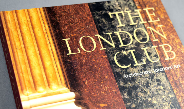
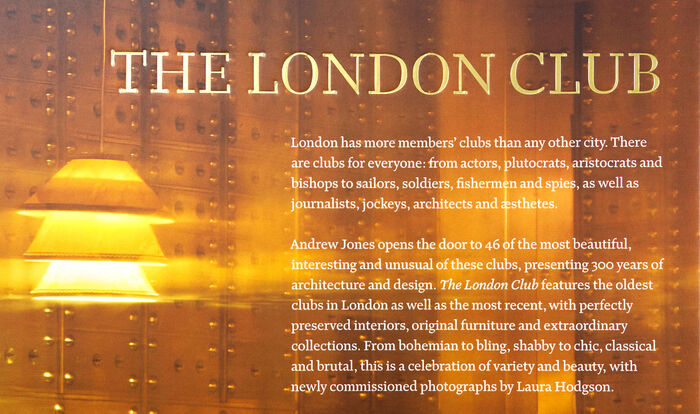
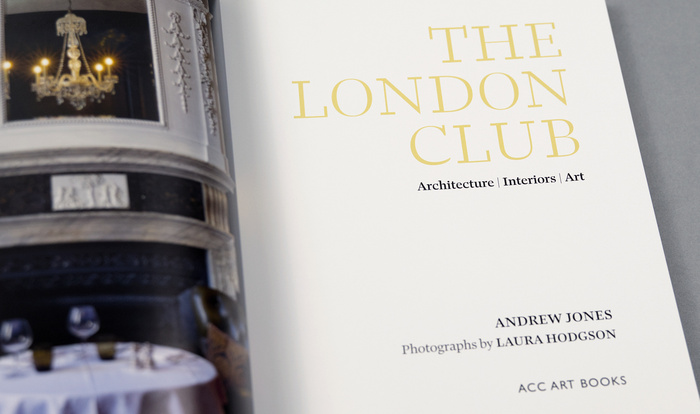
A beautifully designed book written byAndrew Jonesand lavishly illustrated with specially commissioned photographs by Laura Hodgson. London is home to more members’ clubs than any other city. Andrew Jones opens the door to 46 of them, from the oldest to the newest; presenting 300 years of continuing history though their architecture and design.Published byACC Art Booksand designed byNed Campbell, it is the first commercial use of theRavenscartypeface which is used throughout.
Ravenscar embodies intellectual gravitas with refined British sensibility—a typeface that whispers authority rather than shouting it. Its likely rational form model with controlled apertures and vertical stress creates the scholarly weight appropriate for institutional histories, while maintaining enough warmth to invite sustained reading. The typography communicates the hushed reverence of a members' club library, where knowledge is preserved with quiet ceremony.
As the inaugural commercial deployment of Ravenscar, this book perfectly showcases the typeface's rational structure—closed forms and vertical stress axis that echo the architectural permanence of London's historic clubs. The controlled contrast and measured proportions serve extended reading while projecting institutional authority, essential for a scholarly work spanning 300 years of club history. The typeface's British heritage resonates with the subject matter, creating typographic authenticity that commercial alternatives couldn't match.
Working as a single-font system, Ravenscar's weight and style range creates internal hierarchy through structural variation rather than contrasting typefaces. This monotypographic approach reinforces the book's institutional character—like the consistent architectural language of established clubs themselves. The weight variations maintain the rational form model's vertical stress while modulating presence, allowing the typography to recede appropriately behind the commissioned photography while asserting scholarly credibility.