
Ravenscar
Ravenscar exhibits a rational form model with closed apertures and vertical stress, built on a foundation of contemporary serif construction but pushed into decorative territory through distinctive detailing. The contrast level sits in medium territory, creating readable thick-thin relationships without the dramatic modulation of a true Didone. What distinguishes this face is its blend of traditional serif proportions with subtly unconventional terminal treatments and character details that give it personality without sacrificing legibility. The x-height runs moderate relative to the cap height, maintaining classical proportions that ground its more expressive flourishes. This typeface belongs to the contemporary display serif tradition, taking cues from both transitional and modern serif heritage while carving its own path through careful attention to character-level refinement. Ravenscar excels in situations demanding authority with approachability—it brings gravitas to headlines without the cold perfection of geometric alternatives, but its decorative elements and lack of italic support limit its utility in extended text settings.
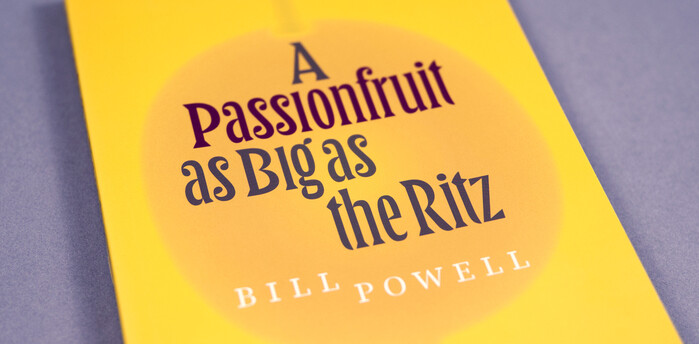
A Passionfruit as Big as the Ritzby Bill Powell
This typography system captures the sophisticated wanderer's voice - a worldly observer who moves between cosmopolitan circles with intellectual curiosity and refined taste. LTR Principia's dynamic letterforms with their open apertures and calligraphic DNA create approachable authority, while Ravenscar's transitional structure carries the editorial gravitas of quality broadsheet journalism. Together they evoke the golden age of travel writing when correspondents were literary figures first, reporters second.
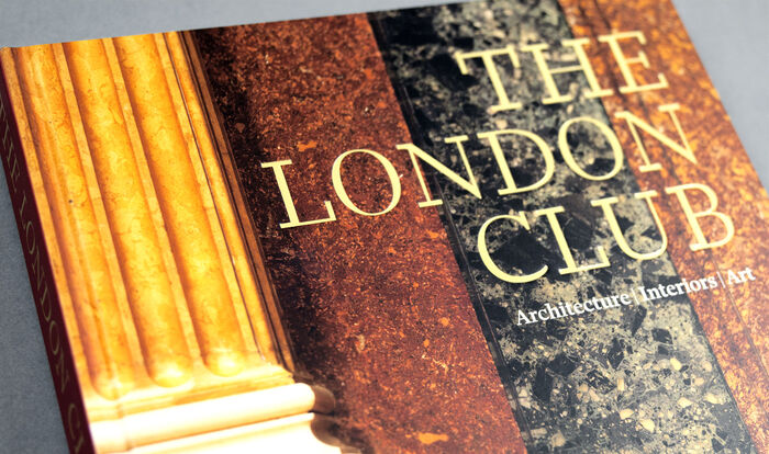
The London ClubbyAndrew Jones
Ravenscar embodies intellectual gravitas with refined British sensibility—a typeface that whispers authority rather than shouting it. Its likely rational form model with controlled apertures and vertical stress creates the scholarly weight appropriate for institutional histories, while maintaining enough warmth to invite sustained reading. The typography communicates the hushed reverence of a members' club library, where knowledge is preserved with quiet ceremony.