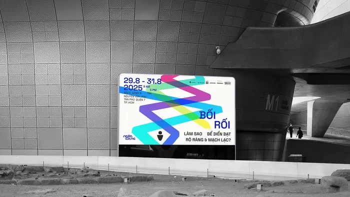
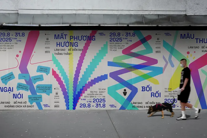
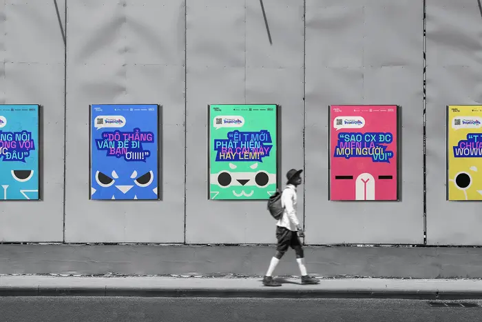
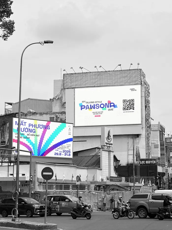
TheNgôn Dạng campaignisHùng Đỗ Mạnh’s Bachelor thesis inVan Lang University’s Graphic Design Honors Program. Ngôn Dạngis an educational communication campaign that helps Gen Z understand their natural communication strengths and develop a personal style that feels authentic and confident. While Gen Z is often seen as outspoken, many young people struggle with self-doubt and social conformity, which gradually limits genuine self-expression. The campaign combines awareness posters, an interactive communication style test, and an educational seminar with talk shows and workshops to encourage self-reflection and practical learning. Through these experiences, participants gain tools to communicate clearly, confidently, and be true to who they are.The campaign concept, “Reflect to ReShape”, draws inspiration from the phenomenon of light bouncing back from a surface. “Reflect”, in this context, is more than a physical process; it represents an inward journey to understand how we communicate with others, whether through habits, preferences, and challenges in communication, and thus, to “ReShape” how we express ourselves.Ngôn Dạng Monois developed based on a 12×12 grid system derived from the wordmark. The custom typeface includes full diacritic support for Vietnamese, ensuring suitability for Vietnamese audiences. At the same time, inspired by Dr. Dellinger’sPsycho-Geometrics, it is designed based on basic geometric shapes, creating tension between straight and curvy lines. In addition, it is combined withFlorian Karsten’sSpace Groteskwithin the same word, creating a visual interest while subtly symbolizing the exchange of information and dialogue inherent in human communication. The complimentary sans isMaison NeuebyTimo Gaessner. A full list of credits can be found on theBehance page.
The typography system communicates intellectual curiosity balanced with approachable warmth. The custom Ngôn Dạng Mono, built on geometric foundations with deliberate tension between straight and curved elements, creates a dynamic-rational hybrid that feels both systematic and human. This structural duality mirrors the campaign's core message of self-reflection and authentic expression, while the monospaced character spacing reinforces the methodical, educational nature of the communication style assessment.
The custom monospace serves dual functions: its grid-based construction reflects the systematic approach to communication analysis, while the geometric-organic tension (inspired by Psycho-Geometrics) visualizes the human complexity the campaign addresses. The pairing with Space Grotesk creates structural dialogue—both fonts share geometric DNA but differ in spacing rhythm, with the mono creating pause and the proportional sans creating flow. This alternation within single words literally embodies the "exchange of information" concept, while Maison Neue provides rational authority for supporting content with its closed apertures and vertical emphasis.
This is a sophisticated three-font system that works through shared geometric form models with strategic differentiation. The custom mono and Space Grotesk create dynamic contrast-with-cohesion—same underlying geometric construction but radically different spacing rhythms that visualize conversational exchange. Maison Neue serves as the rational anchor, providing editorial credibility through its tighter apertures and vertical stress. The system creates meaning through typographic behavior rather than just aesthetic harmony.