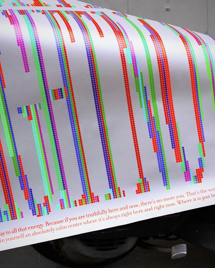
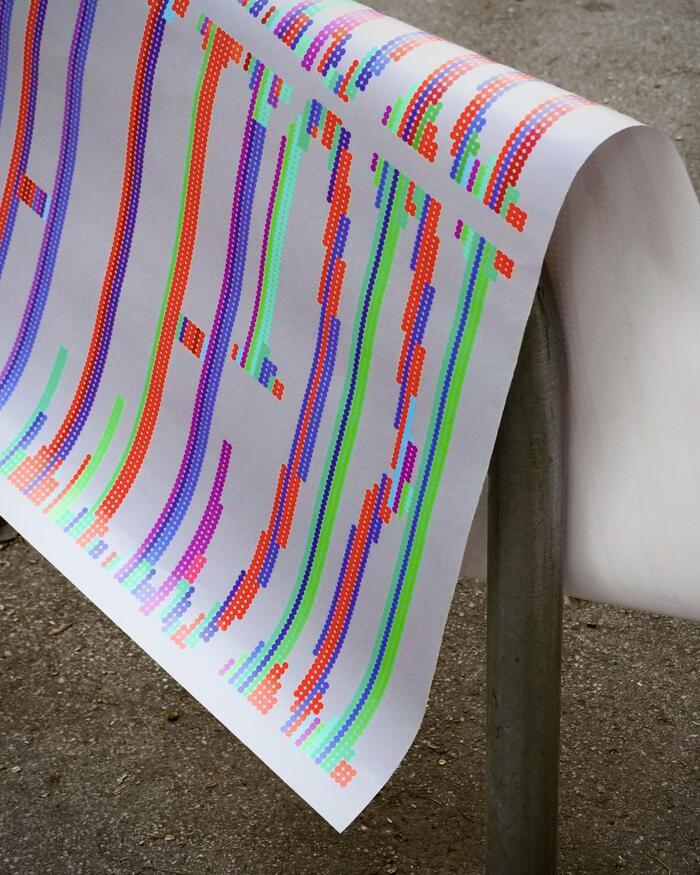
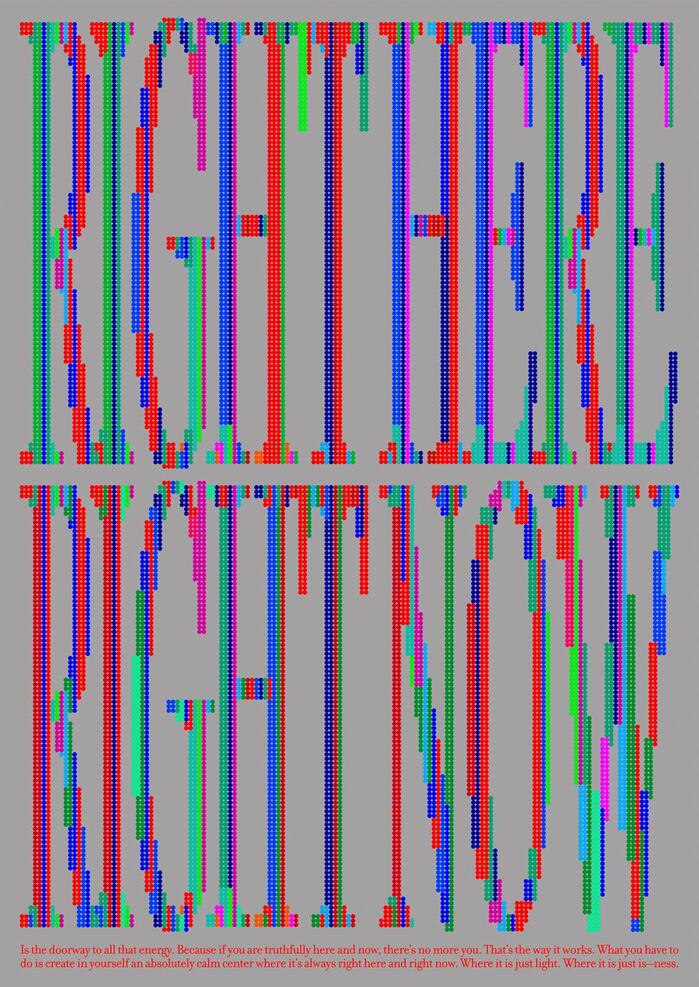
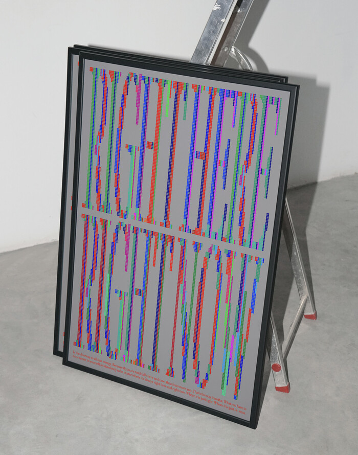
The design explores the idea of transforming a minimal element—a dot—into something expressive and meaningful. It proposes a visual reflection on the present moment, encouraging viewers to slow down, observe, and engage more deeply with what is happening now. The dots that construct the custom letterforms symbolize the multiplicity of experiences and possibilities that exist in the present. At the lower edge of the composition, two lines of text run horizontally across the design. This typographic element reinforces the conceptual message while introducing a chromatic counterpoint to the dominant vertical structure. The use of colors reinforces this concept, evoking a diversity of moments, emotions, and experiences available in the here and now. As a whole, the poster functions as a quiet reminder to pause and reflect, inviting viewers to value subtle details and to perceive everyday life with greater attention and openness.
Filosofia's high-contrast Didone structure creates contemplative gravitas through its radical thick-thin modulation and sharp, unbracketed serifs. The typeface's vertical stress and closed apertures establish meditative authority, while its extreme contrast ratios demand slow, deliberate reading—perfectly embodying the poster's "pause and reflect" philosophy. When deconstructed into dots, Filosofia's classical proportions maintain their dignity even in fragmented form.
Filosofia operates as a rational-model Didone with maximum stroke contrast and vertical stress, creating the typographic equivalent of mindful breathing—moments of visual tension and release. Its closed apertures and high x-height proportions ensure legibility even when atomized into dots, while the classical letterform DNA persists through the deconstruction. The font's inherent formality provides structural backbone for conceptual experimentation, allowing the dots to feel intentional rather than arbitrary.
As a single-font system, Filosofia creates hierarchy through scale and treatment rather than contrasting typefaces. The horizontal text lines at the composition's base use the font's natural weight to anchor the vertical dot-constructed letters, demonstrating how one well-chosen typeface can serve multiple functional roles. The consistent rational form model throughout maintains visual cohesion while allowing dramatic scale and treatment variations.