
Filosofia
Filosofia belongs to the rational form model with vertical stress, closed apertures, and orderly construction that defines the Modern/Didone tradition. The typeface exhibits high contrast between thick and thin strokes with abrupt transitions, creating dramatic tension on the page. Its lowercase features ball terminals on characters like 'a' and 'c', narrow apertures, and a relatively small x-height that emphasizes the cap-height dominated proportions typical of Didones. The face draws from the neoclassical heritage of Bodoni and Didot, maintaining their geometric precision and optical elegance while potentially offering contemporary refinements in spacing and digitization. Filosofia excels in luxury branding and high-end editorial contexts where its theatrical contrast and aristocratic bearing support premium positioning, but its fine hairlines and closed counters make it unsuitable for sustained reading at text sizes.
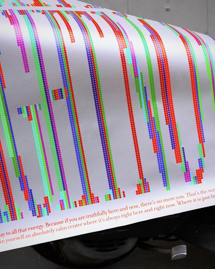
“Here, Now” poster
Filosofia's high-contrast Didone structure creates contemplative gravitas through its radical thick-thin modulation and sharp, unbracketed serifs. The typeface's vertical stress and closed apertures establish meditative authority, while its extreme contrast ratios demand slow, deliberate reading—perfectly embodying the poster's "pause and reflect" philosophy. When deconstructed into dots, Filosofia's classical proportions maintain their dignity even in fragmented form.
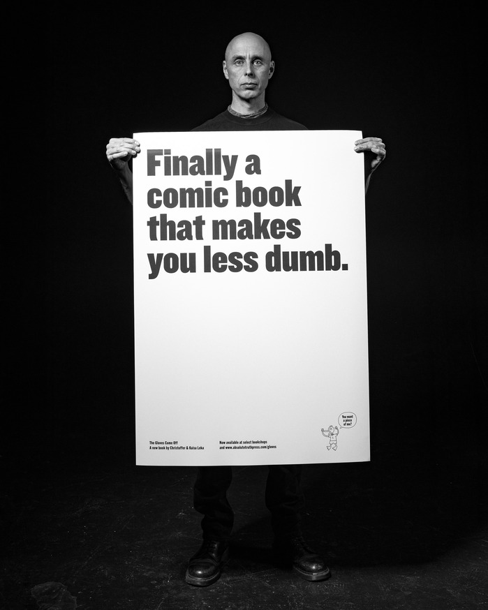
The Gloves Come Off!book launch campaign
This typography system communicates provocative intellectual authority—the kind of academic confidence that isn't afraid to pick fights. Filosofia's high-contrast Bodoni revival brings editorial gravitas with its vertical stress and sharp serifs, while Knockout's condensed industrial forms inject street-level urgency. Together they create a voice that's simultaneously scholarly and subversive, suggesting serious philosophical discourse delivered with punk rock attitude.