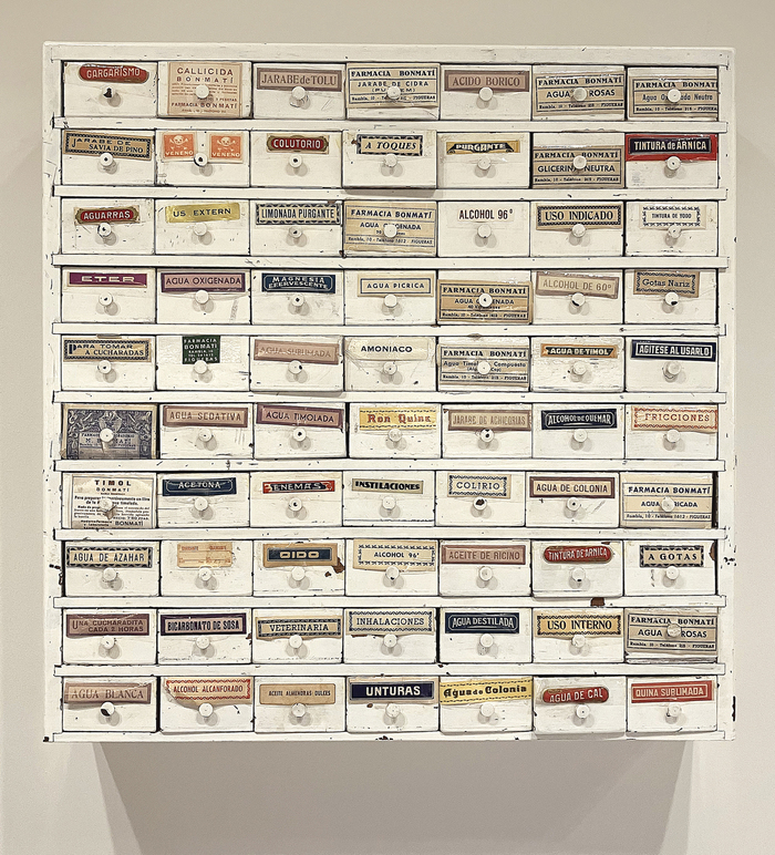
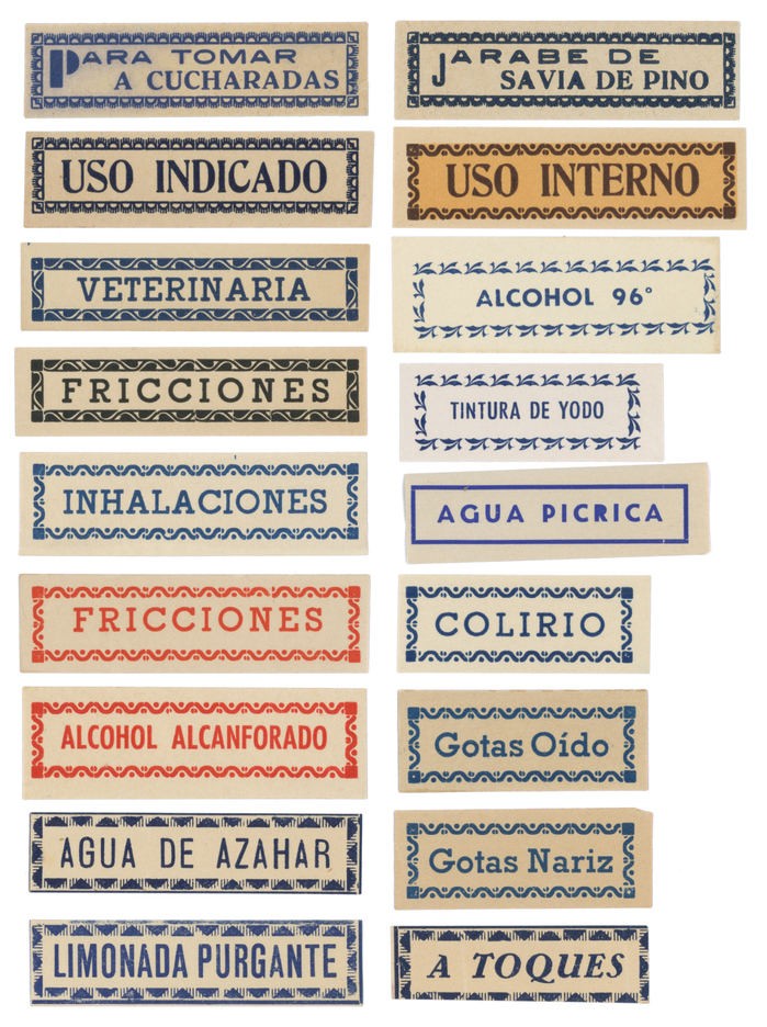
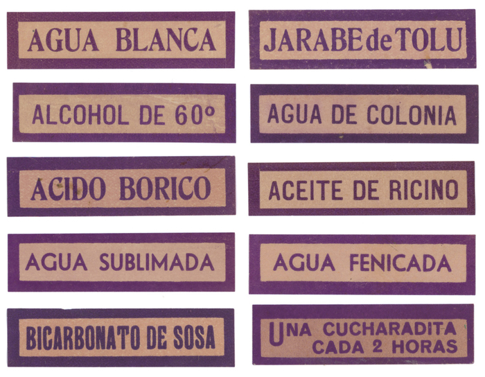
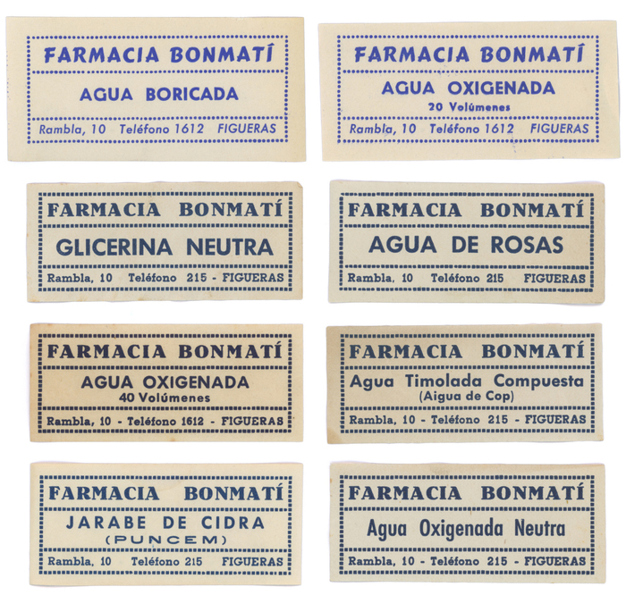
Anadvert from the early 1940splaces the Bonmatí pharmacy at the upperside of the Rambla in Figueres, in the Catalonian region of Girona. Although the pharmacy moved to a new address few years ago, theold signage is still preservedat its original location. At the new address, the Bonmatí family preserves aceramic signand the cabinet that was used to store the labels for the pharmacy’s products. Typography and lettering, letterpress and lithography. A few millimetres of paper were used to create small graphic universes to organise the categories of pharmaceutical products. “Para tomar a cucharadas” and “Jarabe de savia de pino”:Neo Futura(Neufville’s name forFutura Black),Grotesca ancha nueva(Gans), andAntigua Mercedes(Neufville’s name forTages-Antiqua)“Uso indicado” and “Uso interno”:Romanaestrecha negra(Fundición Tipográfica Nacional)“Veterinaria” (and also “Fricciones”, “Inhalaciones” etc.):Cleopatranegra(Iranzo)“Alcohol 96”:Futura(Neufville/Bauer)“Tintura de Yodo” (and “Alcohol alcanforado”): Futura chupada, Neufville’s name forFutura Condensed“Agua picrica”: Predilecta (Iranzo’s version ofKristall-Grotesk)“Limonada purgante”:Grotesca Mercantil(Gans; seeLongina) Rows 1–3:Romanaestrecha negra (serif) and an unidentified sansRow 4:PredilectaRow 5: “Bicarbonato de sosa” is in an unidentified typeface that has several glyphs in common withRoundheadand is also very close toRunic Grotesque(but with asymmetricalT). “Una cucharadita cada 2 horas” is inVenusBold(Bauer). Row 1: Fresko a.k.a.Cartoon(Bauer) withPredilectaRows 2–4:Antigua Mercedes,Futura, andCleopatra. The labels in the last row additionally featuresGrotesca ancha nueva(“Puncem”) andFutura Condensed. Top left (“Timol”): a local version ofZeitungs-Grotesque(Grotesca anchaby Gans,Grotesca negraby FTN, orFette Groteskby Bauer),Venus,Futurachupada negra,Bodoni, and a local version ofCopperplate Gothic(Helénica anchaby Gans orEspartana estrechaby FTN) Top right (“Callicida”): an unidentified wide grotesk,Futura,Venus Bottom left: both weights ofCleopatra,FuturaItalic,Grotesca ancha nueva, and a fineBowl of Hygieia Lithographic labels by J. Garcia printing house, Barcelona. Most text on these is lettering. The address is added inCleopatra.
This eclectic pharmaceutical label system embodies the vernacular authority of mid-20th century European pharmacy culture—a typography of trusted precision wrapped in artisanal warmth. The strategic mixing of geometric forms (Futura's constructed circles), rational grotesks (Venus's closed apertures), and dynamic serifs (the flowing stress of Tages-Antiqua) creates a visual language that speaks to both scientific rigor and human care, reflecting the neighborhood pharmacy's dual role as medical authority and community cornerstone.
The multi-font approach serves the complex informational hierarchy of pharmaceutical labeling, where legal requirements, dosage instructions, and product categories each demand distinct typographic voices. The pairing of geometric sans-serifs (Futura family) with rational grotesks (Venus, Kristall-Grotesk variants) follows Kupferschmid's harmony principle—shared vertical stress and closed apertures create cohesion despite stylistic differences. The inclusion of high-contrast serifs like Bodoni and dynamic forms like Tages-Antiqua provides necessary contrast for brand names and headers, while the condensed widths maximize information density within the constraints of small label formats.
This represents masterful typographic orchestration rather than simple pairing—multiple fonts working within a systematic logic of informational hierarchy. The geometric-rational axis (Futura-Venus-Kristall variants) provides the structural backbone with shared vertical stress and similar x-heights, while high-contrast transitional serifs (Bodoni, Romana) create focal points for brand elements. The system demonstrates sophisticated understanding of optical scaling, using condensed widths for dense information and expanded forms for emphasis, all unified by consistent weight relationships and complementary form models.