
Venus
Venus follows the geometric form model with constructed circular letterforms, uniform stroke weights, and systematically derived proportions that epitomize early 20th-century modernist type design. The face exhibits no stroke contrast and features closed apertures with a vertical stress axis, creating the rational authority typical of geometric sans-serifs. Its distinguishing characteristics include a perfectly circular 'o', single-story 'a', and geometric 'g' with a closed lower bowl—hallmarks of the Futura lineage. Venus belongs to the geometric grotesk tradition, likely emerging from the 1920s-30s fascination with pure geometric forms and industrial precision. In practice, this is a display-oriented face that excels at large sizes where its constructed perfection creates impact, but its closed counters and uniform weight make it challenging for extended reading. The typeface brings a voice of mathematical precision and industrial modernism to the page—confident but potentially cold at smaller sizes.
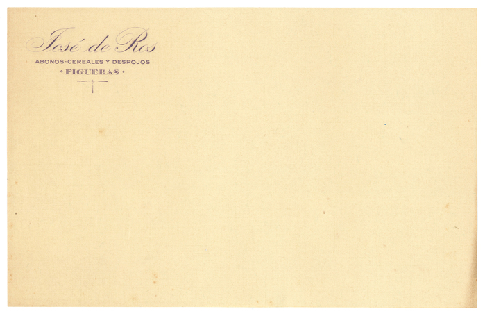
Josep de Ros de Les Olives and the Camponal distillery
This typography system radiates confident industrial eclecticism—the visual language of a prosperous interwar Spanish businessman who understood that different contexts demanded different typographic voices. The mix of Bauer foundry classics (Venus, Bernhard-Antiqua, Kleukens) with Spanish-distributed variants creates a sophisticated pluralism that speaks to both local craft traditions and cosmopolitan European modernization. Rather than systematic brand consistency, this approach embodies the entrepreneurial confidence of someone who could afford the best types available and knew how to deploy them strategically across touchpoints.
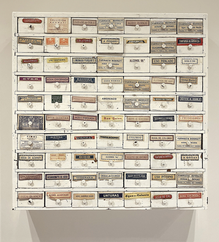
Farmàcia Bonmatí labels
This eclectic pharmaceutical label system embodies the vernacular authority of mid-20th century European pharmacy culture—a typography of trusted precision wrapped in artisanal warmth. The strategic mixing of geometric forms (Futura's constructed circles), rational grotesks (Venus's closed apertures), and dynamic serifs (the flowing stress of Tages-Antiqua) creates a visual language that speaks to both scientific rigor and human care, reflecting the neighborhood pharmacy's dual role as medical authority and community cornerstone.