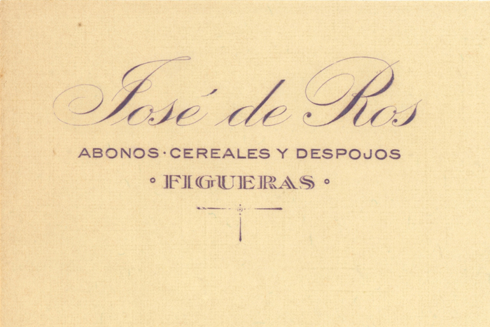

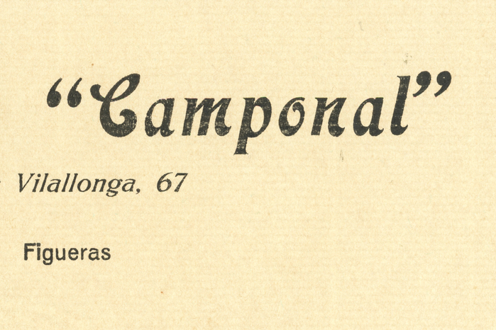
Josep de Ros was an industrialist fromFigueres, Spain, born in the manor house of Les Olives into an aristocratic family. Around 1917, he started a business in the fertilizer sector and opened the Camponal liquor distillery a few years later. He had a warehouse on Vilallonga Avenue in Figueres, near the railway station, close to the border with France. He died in 1935. In the shown letterheads by Josep/José de Ros from around 1930, the difference between typography and lettering is difficult to appreciate (thanks to the staff of Fonts In Use for the clarifications). Detail of the letterhead: “José de Ros / Abonos, cereales y despojos / Figueras”. All three styles are lettering. The name is in an English script close toStempel’sKünstler-Schreibschrift, known in Spanish as Inglesa Artista semi-negra, with an ornamentedJand a characteristic loop around the stem of theR. Josep de Ros i Moner (father) and Josep de Ros i Reig (son) were descendents of Ros de Olano. In Stempel’s 1918 specimen book for the Spanish market, the name ofRos de Olano is set in Inglesa Artista(it’s misspelled as “Olona”; another page in the same book hasthe correct spelling). “Figueras” is drawn in a serif with inline. The structure is very close to theBravourtypeface designed byMartin Jacoby-Boyfor Stempel in 1912), but with sharper serifs, and a wider letterUwith a small spur. I have made a comparison with the solid Bravour negra and the decorated Bravour adornado (Verzierte Bravour). Comparison of the lettered inline caps to the Bravour typeface From the obituary for the father inLa Veu de l’Empordá, 27 December 1919(translated): […] Josep de Ros was from a noble family, from the stately house of Ros located in the town of Les Olives, although the one they owned in this city could also be considered a manor. Among the ancestors of the house are the famous General Ros de Olano, who was a minister of the Crown and commanded an army corps in theAfrican Warduring the years 1859 and 1860. The last Prior of the Monastery ofSanta Maria de Ripollalso came from the Ros family. Detail of the letterhead featuring Merveille, Kleukens, and Venus, all by Bauer/Neufville The Camponal letterhead is typographic: it’s set in the typefacesMerveille,Kleukens-KursivandVenus-Grotesk, all by theBauertype foundry (Merveille originated in the United States under the nameLaclede), and distributed in Spain by theNeufvillebranch in Barcelona. Bauer’s typefaces were the most commonly used ones in Catalonia before theFranco dictatorship(1939). This letterhead helped to locate the forgotten Camponal distillery. Label featuring Venus schmal dreiviertelfett, Fette Grotesk-Kursiv, and Clio a.k.a. Kleopatra The Camponal identity uses other typefaces by Bauer and Neufville, like Antigua Mercedes (the Spanish name ofTages-Antiqua),Bernhard-Antiqua,Fette Grotesk-Kursiv, Carnaby (Marocco), Grotesca Estrecha (Neue enge Zeitungs-Grotesk),Florentiner Mediaeval, andMajestic. A few typefaces could have been sourced from different type foundries based in Madrid and Valencia, likeClio(Ludwig Wagner, 1903) distributed by Neufville/Bauer as Kleopatra and byGansas Aurora; orAurora Grotesk(Wagner & Schmidt, 1908) sold by Gans as Grotesca Ideal and byFundición Tipográfica Nacionalas Grotesca Estrecha. Typography and lettering also coexist in other elements, such as in the Camponal liquour labels and packaging. Learn more about Josep de Ros and the Camponal distillery. Camponal label featuring lettering (white letters), Kleukens-Antiqua, and Majestic Label featuring Kleukens-Antiqua, Venus, and an unidentified typeface (similar to Stempel’sHolzhausen-Antiqua, but with a differentM) Bottle label ft. lettering, an unidentified grotesk for “Licor de Hierbas ‘Camponal’” (similar to Grotesca Favorita by Gans), and Bauer’s Kleopatra Packaging ft. lettering (the reversed letters at the top),Maroccoa.k.a. Carnaby for “Cura estómago e intestinos”,Majesticfor “G. Garriga”, and other unidentified typefaces Camponal ad ft.Bernhard-Antiqua,Universitäts-Antiquaa.k.a Druckhaus-Antiqua,Neue enge Zeitungs-Grotesk,Tages-Antiquaa.k.a. Antigua Mercedes, and others Point-of-sale display ft.Columbus, a version ofEdel-Grotesk(probably Groteska Moderna byFundición Tipográfica Nacional), andSchmale halbfette Etienne Camponal ad ft.Bernhard-Antiqua,Tages-Antiquaa.k.a. Antigua Mercedes,Universitäts-Antiqua,Florentiner Mediaeval,Kleukens-Antiqua, and an unidentified grotesk Address label ft.Etienne Sombreada(Gans’s version ofUmstochene EtiennebySchelter & Giesecke),Venus, andAntigua Veneciana(Gans’s version ofATF’sCheltenham)
This typography system radiates confident industrial eclecticism—the visual language of a prosperous interwar Spanish businessman who understood that different contexts demanded different typographic voices. The mix of Bauer foundry classics (Venus, Bernhard-Antiqua, Kleukens) with Spanish-distributed variants creates a sophisticated pluralism that speaks to both local craft traditions and cosmopolitan European modernization. Rather than systematic brand consistency, this approach embodies the entrepreneurial confidence of someone who could afford the best types available and knew how to deploy them strategically across touchpoints.
The foundational choice of Bauer foundry types reveals sophisticated taste—these were the premium German types distributed through Neufville's Barcelona operation, representing the height of interwar European typography. Venus provides rational grotesk authority with its closed apertures and vertical stress, while Bernhard-Antiqua adds humanist warmth through its dynamic stroke modulation and calligraphic terminals. The strategic mixing of contrasting form models (rational Venus against dynamic Bernhard) creates hierarchical richness rather than chaos, with each typeface's optical properties serving specific communication needs: Venus for industrial authority, Bernhard for personal warmth, Kleukens for decorative flourish.
This isn't systematic pairing but strategic typographic orchestration across multiple touchpoints. The core Venus-Bernhard relationship follows sound contrast principles: rational grotesk paired with dynamic serif creates complementary tension while maintaining professional cohesion. The broader palette violates traditional pairing rules but succeeds through contextual deployment—each face appears where its optical properties best serve function. The eclectic approach reflects 1930s commercial practice where typographic variety signaled prosperity and sophistication rather than brand discipline.