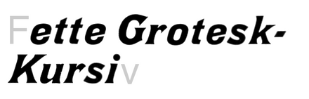
Fette Grotesk-Kursiv
Fette Grotesk-Kursiv represents the bold, industrial expression of 19th-century German grotesque design, built on a rational skeleton with closed apertures and vertical stress that creates an authoritative, mechanical presence. The "Fette" (fat) designation reveals its primary DNA: ultra-bold weight with minimal contrast and sturdy, closed letterforms that prioritize impact over readability. Its grotesk heritage shows in the slightly condensed proportions and robust construction, with letters like 'a' and 'e' maintaining closed counters that create dense typographic color. This face belongs to the tradition of wood type poster fonts, designed for maximum visual impact at large sizes rather than extended reading. The oblique ("Kursiv") styling adds dynamism without compromising the face's industrial strength, making it a powerful tool for headlines that need to command attention. However, its closed apertures and heavy weight make it unsuitable for body text, breaking down completely at small sizes where counters fill in and legibility collapses.