
Tages-Antiqua follows the rational construction model with closed apertures, vertical stress axis, and the systematic order characteristic of neoclassical typography. The face exhibits high stroke contrast with sharp, unbracketed serifs and hairline thin strokes that create dramatic thick-thin transitions typical of the Didone tradition. Its letter proportions suggest a contemporary interpretation of Bodoni-esque geometry, with relatively closed counters and a vertical emphasis that projects authority and formality. The absence of italics immediately signals this as a display-focused design rather than a comprehensive text family. This typeface belongs to the lineage of modern serif revivals that prioritize dramatic contrast over readability, departing from convention through its likely contemporary detailing while maintaining classical Didone DNA. Practically, Tages-Antiqua excels in large-scale applications where its high contrast can be appreciated, but the fine hairlines and closed forms make it unsuitable for extended reading or small sizes where detail collapses.
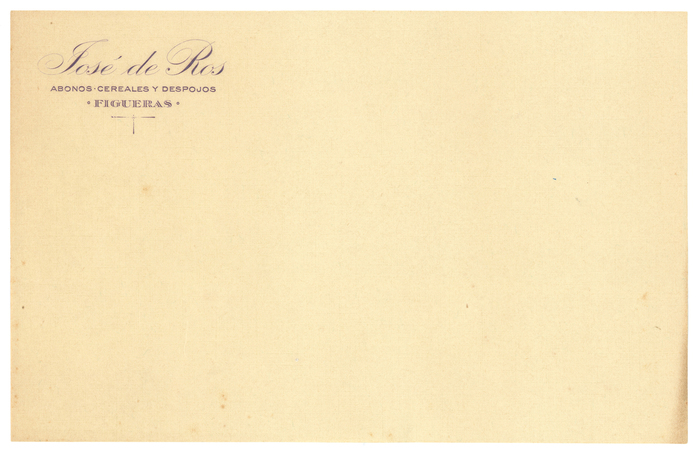
Josep de Ros de Les Olives and the Camponal distillery
This typography system radiates confident industrial eclecticism—the visual language of a prosperous interwar Spanish businessman who understood that different contexts demanded different typographic voices. The mix of Bauer foundry classics (Venus, Bernhard-Antiqua, Kleukens) with Spanish-distributed variants creates a sophisticated pluralism that speaks to both local craft traditions and cosmopolitan European modernization. Rather than systematic brand consistency, this approach embodies the entrepreneurial confidence of someone who could afford the best types available and knew how to deploy them strategically across touchpoints.
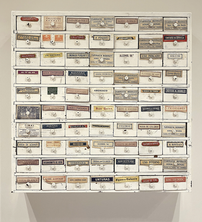
Farmàcia Bonmatí labels
This eclectic pharmaceutical label system embodies the vernacular authority of mid-20th century European pharmacy culture—a typography of trusted precision wrapped in artisanal warmth. The strategic mixing of geometric forms (Futura's constructed circles), rational grotesks (Venus's closed apertures), and dynamic serifs (the flowing stress of Tages-Antiqua) creates a visual language that speaks to both scientific rigor and human care, reflecting the neighborhood pharmacy's dual role as medical authority and community cornerstone.