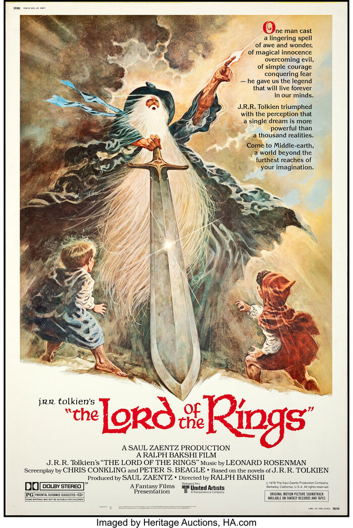
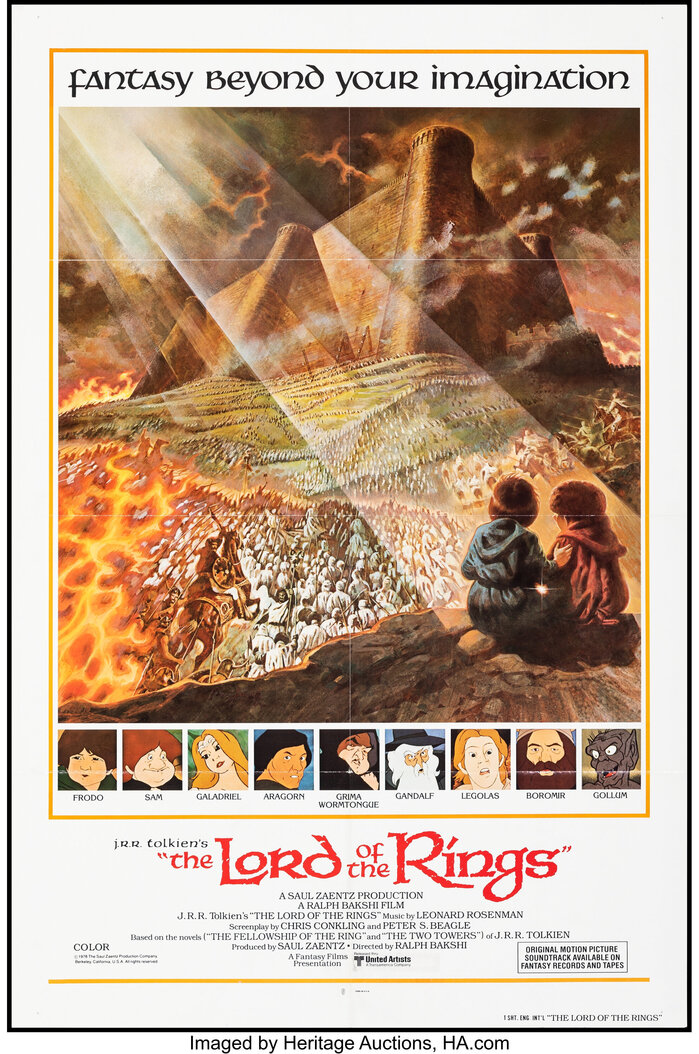
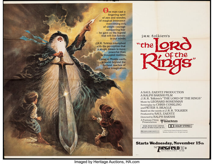
The Lord of the Ringsis a 1978 animatedepicfantasy filmdirected byRalph Bakshifrom a screenplay byChris ConklingandPeter S. Beagle. It is based on the novelof the same namebyJ. R. R. Tolkien, adapting from the volumesThe Fellowship of the RingandThe Two Towers. Set inMiddle-earth, the film follows a group of fantasy races—Hobbits,Men, anElf, aDwarfand awizard—who form afellowshipto destroy a magical ring made by the Dark LordSauron, the main antagonist. While the art on the posters is byTom Jung, the title is shown in lettering loosely based onVictor Hammer’sHammer-Unziale(1923). It’s paired withAmerican Uncial(1943) – a later typeface by the same designer – for Tolkien’s name. Hammer-Unziale also sees direct use for “fantasy beyond your imagination” on the poster shown below. The billing block is set inITC Bookman.ITC Korinna, another design byEd Benguiat, features for the synposis and the character names, respectively.
This typography conjures mystical authority through calligraphic gravitas—the uncial forms evoke medieval manuscripts and ancient wisdom, while their robust, hand-carved quality suggests both magical power and earthbound craft. The lettering's biform character (mixing upper and lowercase proportions) creates an otherworldly formality that bridges the sacred and the fantastical, communicating that this Middle-earth is both mythic and tangible.
Victor Hammer's uncial designs operate within a dynamic form model with organic stress and open apertures that reference calligraphic origins, perfect for fantasy's need to feel both ancient and alive. The American Uncial's broader proportions and softer terminals provide textural contrast to Hammer-Unziale's more angular cuts, while ITC Bookman's rational vertical stress grounds the billing in readable authority. This creates a hierarchy from mystical (uncial title) to literary (Bookman credits) that mirrors the story's journey from wonder to reality.
The uncial pairing works through shared DNA—both Hammer designs spring from the same calligraphic tradition but express different moods through proportion and terminal treatment. American Uncial's rounder, more approachable forms complement Hammer-Unziale's sharper medieval authority, creating contrast-with-cohesion. The rational ITC Bookman provides necessary grounding, its closed apertures and vertical stress offering readable counterpoint to the uncials' organic flow without breaking the historical continuity.