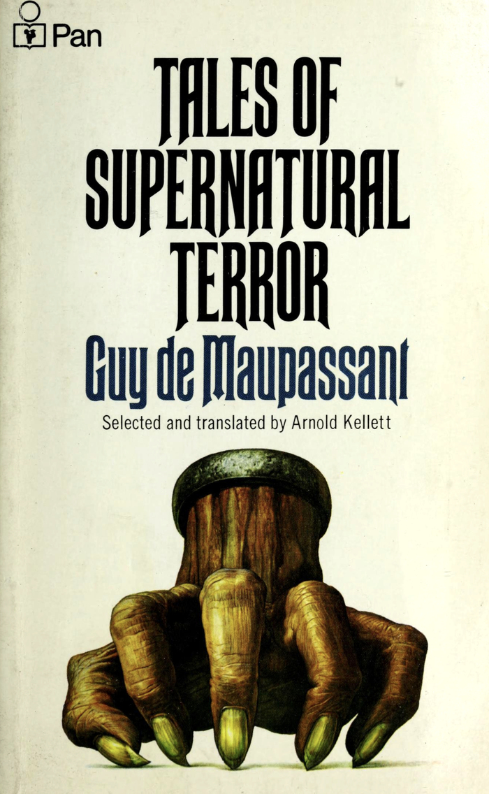
These tales of supernatural terror by French authorGuy de Maupassant(1850–1893), master of the short story, were selected and translated by Arnold Kellett, and published byPan Booksin 1972. The cover art is byJosh Kirby, depicting the protagonist of the first story,La Main d’écorché(The Hand). The suffocatingly narrow typeface to go with it isRubens. Its diagonal terminals nicely echo the fingernails.
Rubens creates a suffocating, claustrophobic tension through its ultra-condensed proportions and sharp diagonal terminals that literally echo the fingernails depicted in Kirby's cover art. The typeface's rational form model—with closed apertures and vertical stress—combined with its extreme compression generates an unsettling, constricted energy that mirrors the psychological horror of Maupassant's supernatural tales. This isn't merely "creepy" typography; it's letterforms that physically embody the sensation of being trapped.
Rubens' ultra-condensed rational structure serves the horror genre brilliantly—its closed apertures and vertical stress create authority befitting literary classics, while the extreme compression generates claustrophobic unease. The diagonal terminals provide crucial textural detail that connects typographically to the cover's fingernail imagery, creating visual-textual synthesis. News Gothic as the secondary font maintains rational clarity for body text while stepping back to let Rubens dominate the atmospheric work, demonstrating smart hierarchical restraint.
Both fonts share a rational form model with vertical stress and closed apertures, creating structural harmony despite their contrast in width and personality. This follows Kupferschmid's principle of same form model + different expression = successful pairing. News Gothic's standard proportions provide readable counterpoint to Rubens' extreme condensation, while both maintain the editorial authority needed for literary publishing. The pairing works through degree rather than opposition.