
Rubens follows the rational form model with closed apertures, vertical stress axis, and systematic construction that prioritizes order over warmth. Its high-contrast DNA reveals pronounced thick-thin stroke modulation characteristic of the Didone tradition, with hairline serifs that terminate in sharp, unbracketed angles. The letterforms exhibit dramatic contrast ratios that create strong vertical rhythm, while the closed counters in 'e' and 'a' reinforce its authoritative, reserved personality. This typeface descends from the classical Modern serif lineage established by Bodoni and Didot, but pushes the contrast even further into display territory. The extreme stroke variation and delicate hairlines make it unsuitable for text sizes, where the thin strokes would disappear or create uneven typographic color. Rubens excels as a headline face where its theatrical contrast can command attention, but it demands careful handling and generous sizing to maintain legibility.
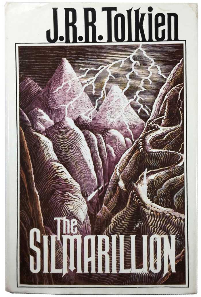
The Silmarillionby J.R.R. Tolkien, Houghton Mifflin
This typography system creates a scholarly-romantic energy that bridges academic gravitas with mythic imagination. Rubens' towering capitals and classical proportions establish epic grandeur, while Perpetua's carved-stone character and Imprint's readable warmth suggest the work of a medieval scribe translating ancient tales. The rational form models across all three faces—with their vertical stress and controlled apertures—create unified authority befitting Tolkien's role as both author and linguistic scholar.
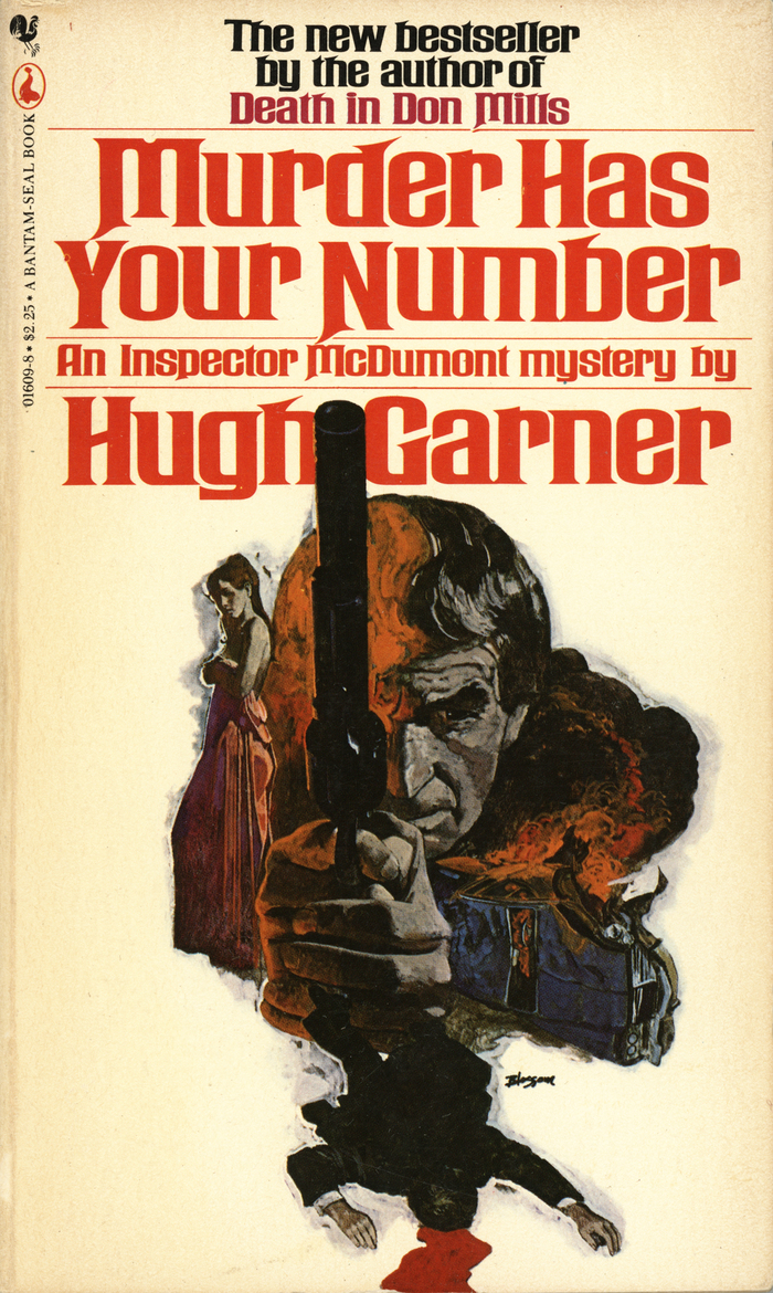
Murder Has Your Numberby Hugh Garner, Bantam
Rubens Bold delivers theatrical gravitas with its wide, compressed letterforms and dramatic contrast between thick and thin strokes. The extra-wide proportions create an imposing, cinematic presence that suggests noir tension and pulp drama. This is rational authority pushed toward melodrama—the vertical stress and closed apertures maintain editorial credibility while the extreme width adds sensational impact perfect for mystery paperbacks.
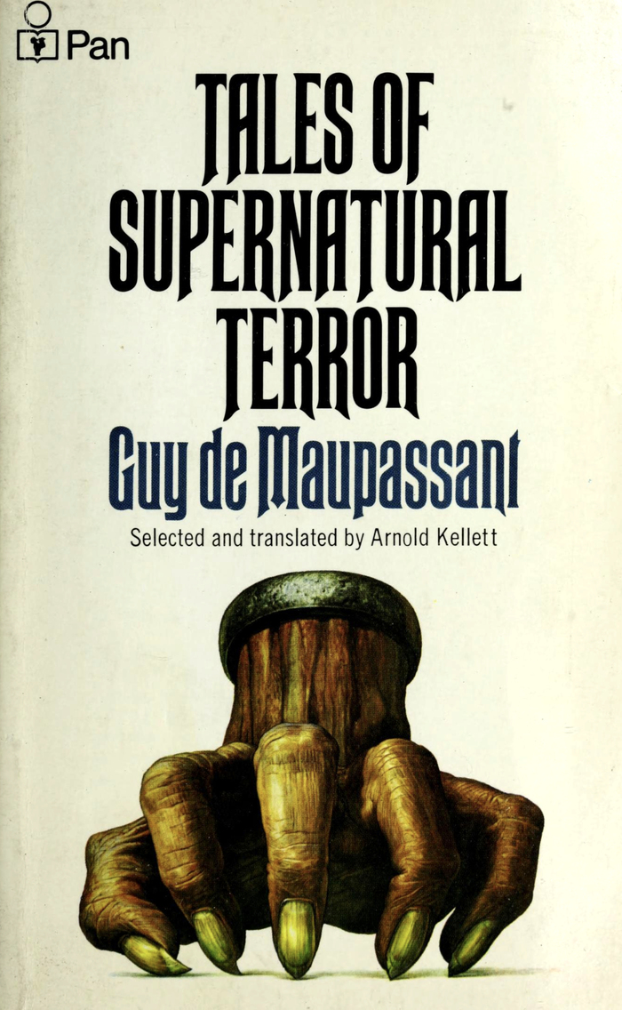
Tales of Supernatural Terrorby Guy de Maupassant, Pan
Rubens creates a suffocating, claustrophobic tension through its ultra-condensed proportions and sharp diagonal terminals that literally echo the fingernails depicted in Kirby's cover art. The typeface's rational form model—with closed apertures and vertical stress—combined with its extreme compression generates an unsettling, constricted energy that mirrors the psychological horror of Maupassant's supernatural tales. This isn't merely "creepy" typography; it's letterforms that physically embody the sensation of being trapped.