
Imprint
Imprint follows the rational form model with its vertical stress axis, closed apertures, and orderly construction that prioritizes authority over warmth. The face exhibits high contrast between thick and thin strokes, creating dramatic modulation that places it firmly in the Didone tradition, though with slightly more robust hairlines than pure classical examples like Bodoni. Its distinguishing features include sharp, unbracketed serifs, pronounced ball terminals on letters like 'a' and 'c', and relatively closed counters that maintain the rational skeleton's reserved character. The x-height sits moderately low relative to the cap height, following traditional proportions. This typeface descends from the late 18th-century modern serif lineage but shows evidence of 20th-century revival sensibilities—the hairlines are thickened just enough to survive mechanical reproduction, suggesting it was designed for practical commercial use rather than pure classical revival. Imprint excels in formal contexts where authority and gravitas are paramount, but its high contrast and closed forms make it unsuitable for extended reading at text sizes, breaking down when the delicate hairlines become too thin to reproduce reliably.
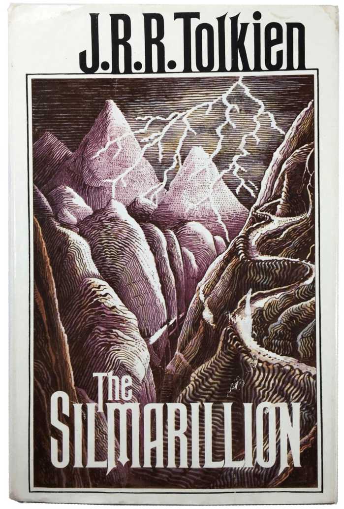
The Silmarillionby J.R.R. Tolkien, Houghton Mifflin
This typography system creates a scholarly-romantic energy that bridges academic gravitas with mythic imagination. Rubens' towering capitals and classical proportions establish epic grandeur, while Perpetua's carved-stone character and Imprint's readable warmth suggest the work of a medieval scribe translating ancient tales. The rational form models across all three faces—with their vertical stress and controlled apertures—create unified authority befitting Tolkien's role as both author and linguistic scholar.
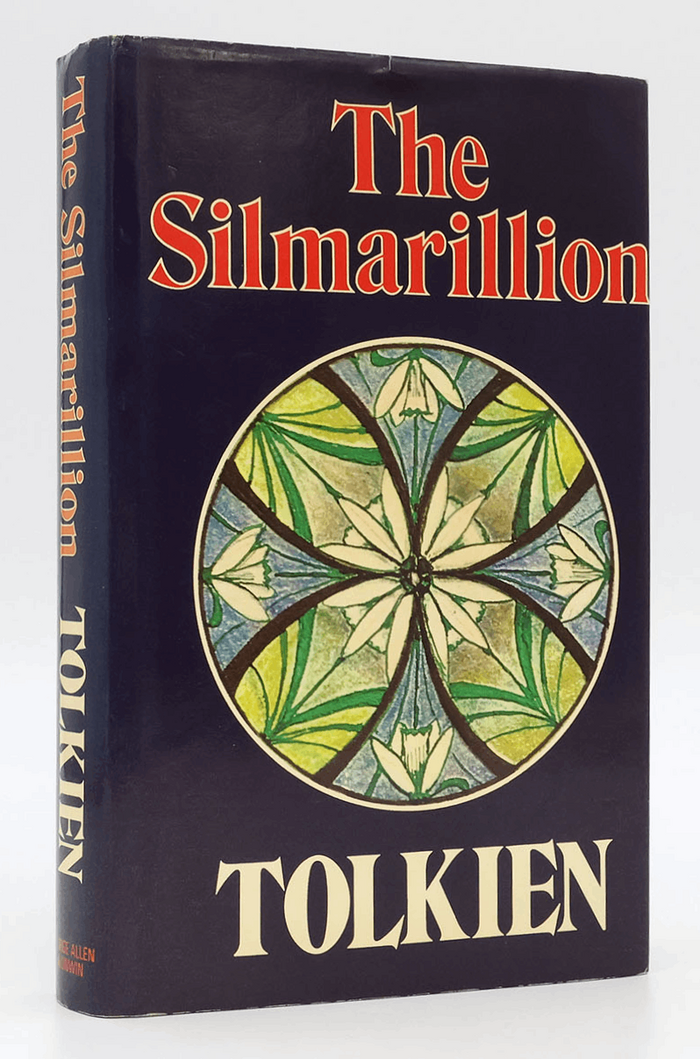
The SilmarillionbyJ.R.R. Tolkien
This typography system channels scholarly gravitas with mythological resonance. The Perpetua title treatment draws from Gill's stone-carved origins, creating monumental authority that befits Tolkien's grand cosmological narrative, while Imprint's transitional warmth provides readability without sacrificing the elevated, antiquarian character essential for presenting this posthumously assembled mythology as canonical literature.