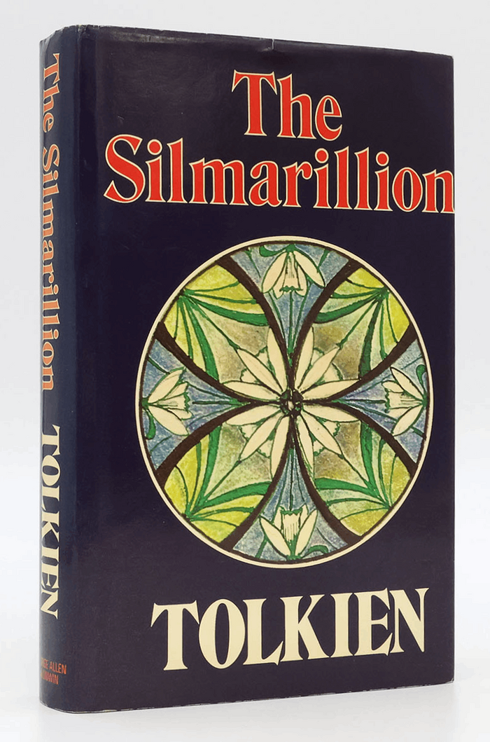
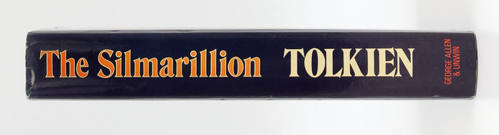
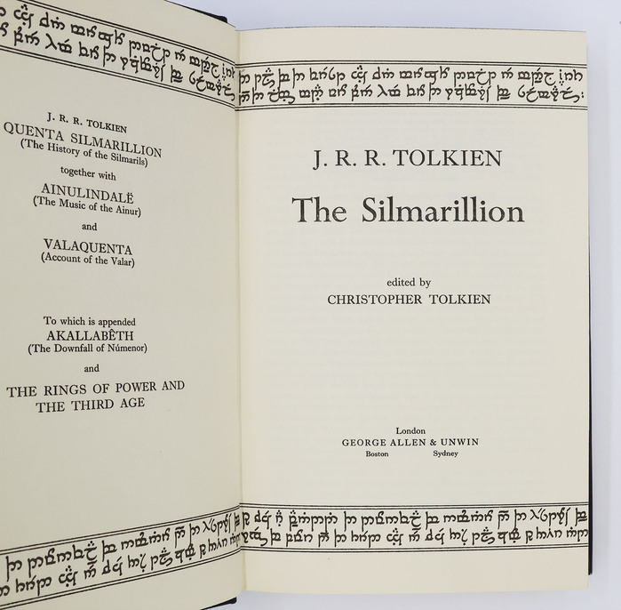
The Silmarillion(Quenya:[silmaˈrilːiɔn]) is a book consisting of a collection ofmythsand stories in varying styles by the English writerJ.R.R. Tolkien. It was edited, partly written, and published posthumously by his sonChristopherin 1977, assisted byGuy Gavriel Kay, who became a fantasy author. It tells ofEä, a fictional universe that includes the Blessed Realm ofValinor, the ill-fated region ofBeleriand, the island ofNúmenor, and the continent ofMiddle-earth, where Tolkien’s most popular works—The HobbitandThe Lord of the Rings—are set. After the success ofThe Hobbit, Tolkien’s publisher,Stanley Unwin, requested a sequel, and Tolkien offered a draft of the writings that would later becomeThe Silmarillion. Unwin rejected this proposal, calling the draft obscure and “too Celtic”, so Tolkien began working on a new story that eventually becameThe Lord of the Rings. The first editionbyAllen & UnwinusesHawthornon the book jacket, with emblems drawn by Tolkien himself:Lúthien Tinúviel’s on the front panel, and those ofFingolfin,Eärendil,Idril Celebrindal,Elwë, andFëanoron the back. The title page is set inPerpetuaandImprint. The latter is also used as text typeface.
This typography system channels scholarly gravitas with mythological resonance. The Perpetua title treatment draws from Gill's stone-carved origins, creating monumental authority that befits Tolkien's grand cosmological narrative, while Imprint's transitional warmth provides readability without sacrificing the elevated, antiquarian character essential for presenting this posthumously assembled mythology as canonical literature.
Perpetua's dynamic form model—with its open apertures and subtle calligraphic stress—bridges classical authority with organic warmth, perfectly suited for a mythological work rooted in philological scholarship. Imprint's transitional structure shares Perpetua's vertical emphasis but offers higher x-height and more generous letter spacing for sustained reading, while its moderate contrast maintains textual dignity without the stark modernity that would clash with Tolkien's archaic linguistic register.
This pairing exemplifies contrast-with-cohesion through shared dynamic form models but differentiated surface expression. Both Perpetua and Imprint carry calligraphic DNA and moderate contrast, creating structural harmony while Perpetua's stone-carved monumentality contrasts with Imprint's book-bred refinement. The addition of Hawthorn for display likely introduces deliberate archaism, though without seeing the execution, this risks stylistic overreach.