
Perpetua operates from a dynamic skeleton with diagonal stress and open apertures, rooted in Eric Gill's stone-carving sensibilities rather than calligraphic tradition. Its moderate contrast behavior and slightly condensed proportions create a distinctive crystalline quality—letters feel carved rather than written. The face exhibits sharp, wedge-shaped serifs and angular terminals that give it an architectural precision uncommon in humanist designs. Perpetua belongs to the British stone-carved tradition alongside Gill Sans, departing from Renaissance models through its geometric undertones and compressed letterforms. In practice, this typeface excels in editorial contexts where its sculptural authority commands attention, but its narrow set width and fine details limit its versatility at small sizes. The lack of italics severely constrains its typographic utility, relegating it primarily to display and headline roles where its lapidary character can be fully appreciated.
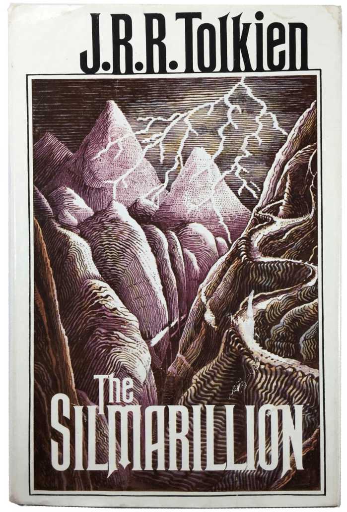
The Silmarillionby J.R.R. Tolkien, Houghton Mifflin
This typography system creates a scholarly-romantic energy that bridges academic gravitas with mythic imagination. Rubens' towering capitals and classical proportions establish epic grandeur, while Perpetua's carved-stone character and Imprint's readable warmth suggest the work of a medieval scribe translating ancient tales. The rational form models across all three faces—with their vertical stress and controlled apertures—create unified authority befitting Tolkien's role as both author and linguistic scholar.
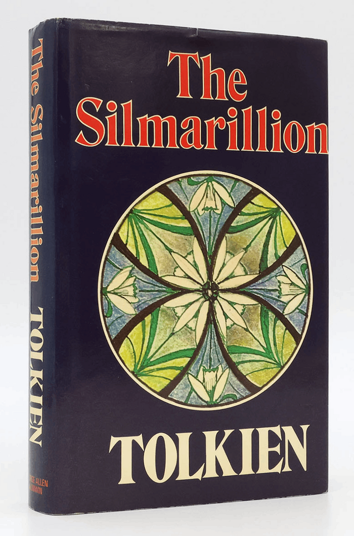
The SilmarillionbyJ.R.R. Tolkien
This typography system channels scholarly gravitas with mythological resonance. The Perpetua title treatment draws from Gill's stone-carved origins, creating monumental authority that befits Tolkien's grand cosmological narrative, while Imprint's transitional warmth provides readability without sacrificing the elevated, antiquarian character essential for presenting this posthumously assembled mythology as canonical literature.