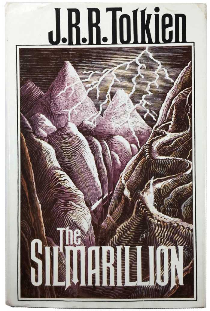
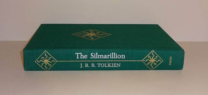
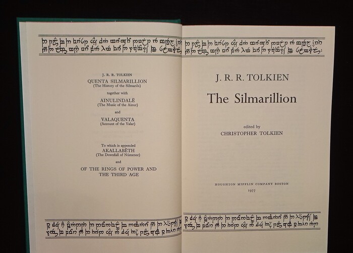
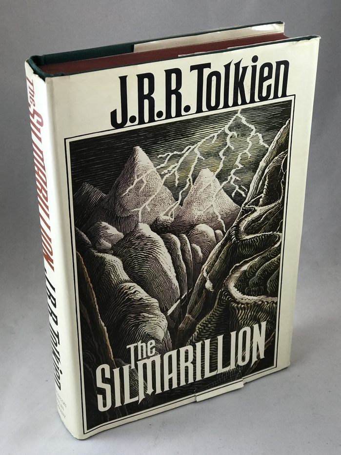
J.R.R. Tolkien’sSilmarillionwasfirst published by Allen & Unwin in London(withHawthornfor the jacket typography). Shown here is the first U.S. edition, byHoughton Mifflin, withcover artby Tolkien himself. The display typeface isRubens. Note how theJtowers a little over the other capitals because its base was aligned to the line of the frame, instead of letting it overshoot. The typography on the spine and inside the book follows the British precursor, withPerpetuaandImprint.
This typography system creates a scholarly-romantic energy that bridges academic gravitas with mythic imagination. Rubens' towering capitals and classical proportions establish epic grandeur, while Perpetua's carved-stone character and Imprint's readable warmth suggest the work of a medieval scribe translating ancient tales. The rational form models across all three faces—with their vertical stress and controlled apertures—create unified authority befitting Tolkien's role as both author and linguistic scholar.
The rational form models across Rubens, Perpetua, and Imprint create structural coherence while serving distinct hierarchical functions. Rubens' high-contrast classical capitals provide the necessary epic scale for a mythological work, with its vertical stress and closed apertures conveying timeless authority. Perpetua's stone-carved character bridges display and text, offering the gravitas of inscriptional forms with readable proportions, while Imprint's transitional warmth ensures sustained reading comfort. This graduated contrast system—from high-contrast display to mid-contrast text—supports both the work's scholarly credentials and narrative accessibility.
This three-font system demonstrates masterful contrast-within-cohesion, with all faces sharing rational form models but varying contrast levels for functional hierarchy. The pairing follows Kupferschmid's harmony principle: same underlying structural DNA (vertical stress, controlled apertures, classical proportions) with different surface expressions. Rubens provides the high-contrast display authority, Perpetua offers mid-contrast transitional elegance, and Imprint delivers low-contrast reading comfort—creating a seamless typographic ecosystem that moves from epic proclamation to intimate storytelling without structural discord.