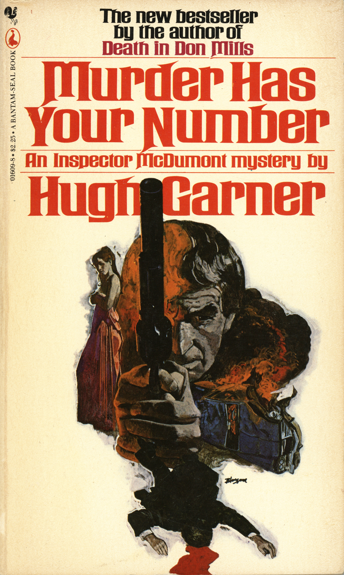
The Bantam-Seal edition of thisInspector McDumontmystery by Canadian novelistHugh Garner(1913–1979) was published in 1979. The font in use isPhoto-Lettering’sRubens Bold. Issued by 1965, this style is the widest of several extra widths added to their adaptation ofRubens.
Rubens Bold delivers theatrical gravitas with its wide, compressed letterforms and dramatic contrast between thick and thin strokes. The extra-wide proportions create an imposing, cinematic presence that suggests noir tension and pulp drama. This is rational authority pushed toward melodrama—the vertical stress and closed apertures maintain editorial credibility while the extreme width adds sensational impact perfect for mystery paperbacks.
Rubens Bold's rational form model with vertical stress and controlled apertures establishes literary authority, while its extreme width creates shelf impact crucial for mass-market paperbacks. The high contrast and dramatic proportions evoke the noir aesthetic of 1970s detective fiction, where typography needed to telegraph genre instantly. The compressed letterforms maximize title impact within limited cover real estate while maintaining legibility at small sizes—essential for paperback distribution.
As a single-font solution, Rubens Bold creates hierarchy through its dramatic contrast range rather than font pairing. The bold weight provides title dominance while maintaining enough refinement for author names at smaller sizes. This self-contained approach was typical of 1970s paperback design, where one well-chosen display face handled all typographic duties through weight and size variation rather than mixing typefaces.