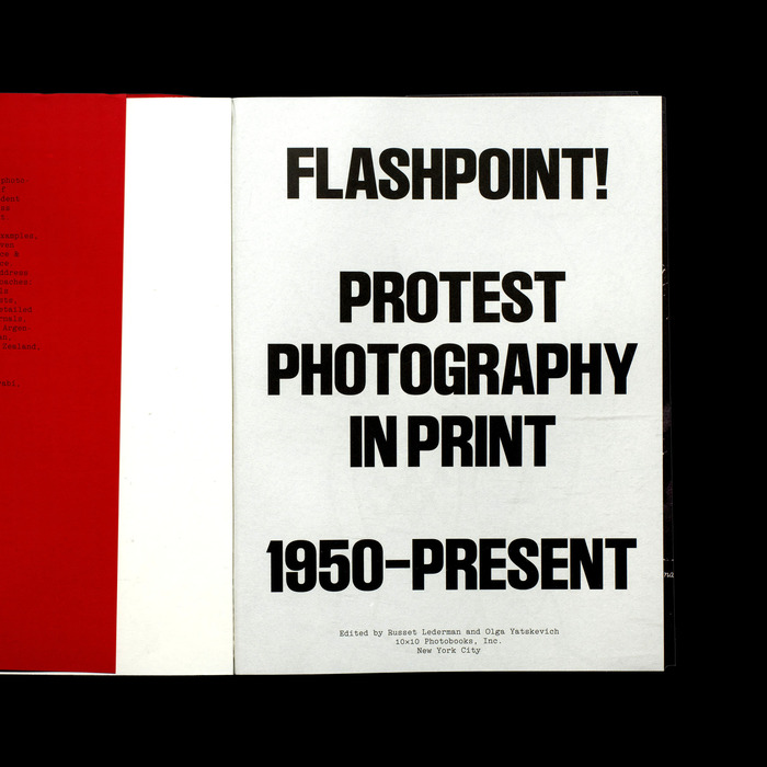
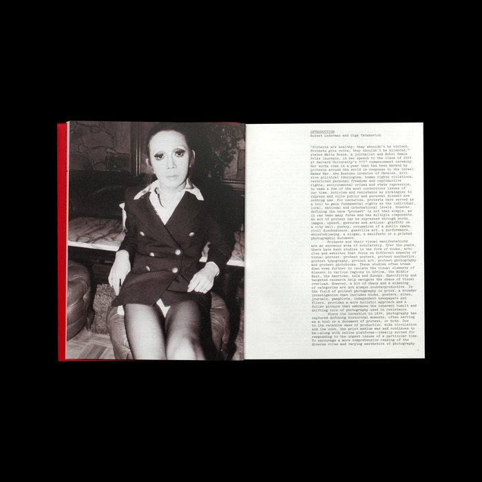
Since its inception, photography has captured defining historical moments, serving as either a tool or a document of protest.Flashpoint!explores the diverse roles and varying aesthetics that photography in print undertakes in its support of protest and resistance.Ruder Plakatand a custom version of Luca Pellegrini’sElectawere used throughout the book. Ruder Plakat, based onEmil Ruder’s poster typewhich was developed with students at Allgemeine Gewerbeschule Basel (AGS), served as the perfect display font for a project about civil resistance. Electa, in turn, was used for all body text as well as meta data, captions and references. Being the result of Luca’s obsessive study of an Olivetti typewriter, its historic charm with strict sophistication performed in pretty much every setting we put it in. The book was edited by Russet Lederman and Olga Yatskevich and published by10×10 Photobooks: Flashpoint!, an anthology focusing on protest photography in print, presents a global selection of photobooks, zines, posters, pamphlets, independent journals and alternative newspapers that address protest and resistance from the 1950s to the present.
This typography system embodies activist-intellectual authority through the marriage of Swiss rationalist discipline with typewriter authenticity. LL Ruder Plakat's bold constructivist forms channel the geometric clarity of protest graphics, while LL Electa's monospaced character carries the urgency and democratic accessibility of underground publishing—evoking both the typewritten manifestos of resistance movements and the mechanical reproduction that democratized radical ideas.
The pairing operates on brilliant conceptual logic: Ruder Plakat represents the rational-geometric tradition of Swiss design education (directly referencing Emil Ruder's AGS poster work), providing authoritative display hierarchy, while Electa draws from dynamic typewriter mechanics with its monospaced rhythm and industrial character. The fonts share vertical stress and constructed clarity but diverge in their texture—Ruder's clean geometry against Electa's typewriter irregularity—creating perfect tension between institutional authority and grassroots authenticity for a project documenting protest photography's dual nature as both art object and activist tool.
This is contrast-with-cohesion executed through shared rational underpinnings but divergent surface textures. Both fonts carry vertical stress and constructed clarity—Ruder Plakat's pure geometric rationalism harmonizing with Electa's mechanically rational monospacing. The pairing works because they represent complementary aspects of the same historical moment: Swiss design's institutional authority meeting the democratic accessibility of typewriter technology, perfectly mirroring how protest photography operates between high art and street-level documentation.