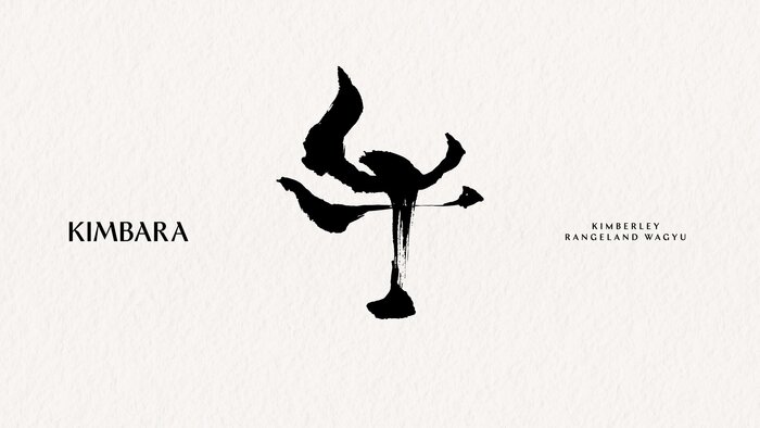
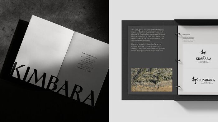
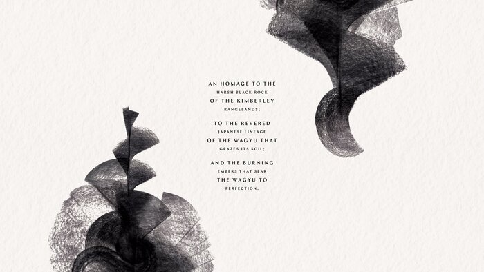
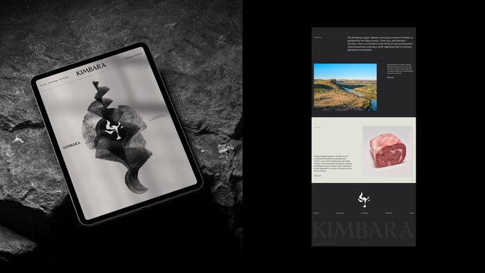
Branding forKimbara premium waygu, Japanese-style beef from Kimberly, Australia. The design is minimalist, mostly black and white, and relies on typography and calligraphy to make it distinctive. Two display typefaces are combined:Ergonfor the main wordmark andChapfor titles and headlines. From the words ofBlock, the branding studio behind the project: The brand is built from contrast. Japanese bloodlines, raised in the wilds of the Kimberley. Refined craft, grounded in rugged country. Kimbara’s identity draws directly from this terrain – a mineral-rich palette inspired by the region’s iconic black rock formations. At its heart is the Wagyu itself, introduced through a bespoke logomark based on the Japanese character for ‘GYU’ (cow). To bring this to life, master Japanese calligrapherMaki Shimanowas commissioned. Her brushstrokes – elegant, angular and expressive – gave the mark both cultural resonance and visual power. Paired with a bold, modern wordmark, the final identity is a collision of heritage and place. It speaks fluent Wagyu, but with an unmistakable Australian accent. The website was built byStartand additionally usesTT Commonsfor small text.
The typography articulates a sophisticated collision of Japanese precision and Australian ruggedness through deliberate structural contrast. Ergon's rational form model—with its closed apertures and vertical stress—anchors the wordmark in contemporary authority, while Chap's dynamic forms echo the commissioned calligraphy's gestural energy. This creates a brand voice that speaks fluent luxury but with territorial confidence, balancing refinement with an unmistakable sense of place.
Ergon serves as the rational anchor with its closed apertures and vertical stress axis, providing corporate credibility essential for premium food positioning. Chap's dynamic form model—featuring more open apertures and diagonal energy—creates visual kinship with the bespoke Japanese calligraphy without literal mimicry. The pairing works because both typefaces share similar x-height proportions and weight distribution, allowing the contrast to emerge through form philosophy rather than optical incompatibility.
This represents a textbook application of Kupferschmid's contrast-with-cohesion principle: different form models (rational Ergon, dynamic Chap) unified by shared proportional DNA and weight treatment. The rational-to-dynamic progression mirrors the brand's conceptual arc from corporate premium positioning to cultural authenticity. TT Commons as the rational utility player provides hierarchy without competing with the display faces' distinctive personalities.