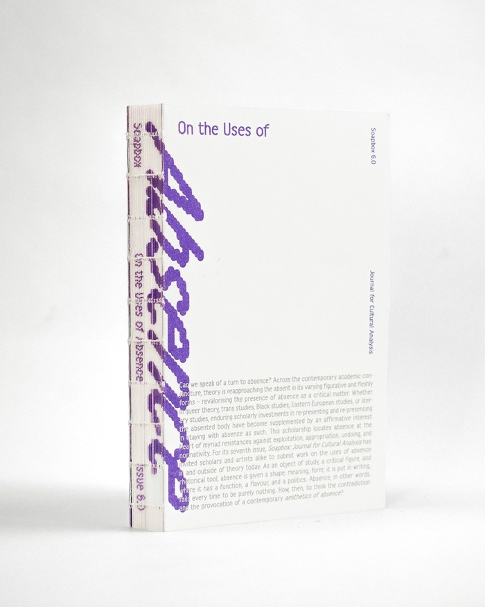
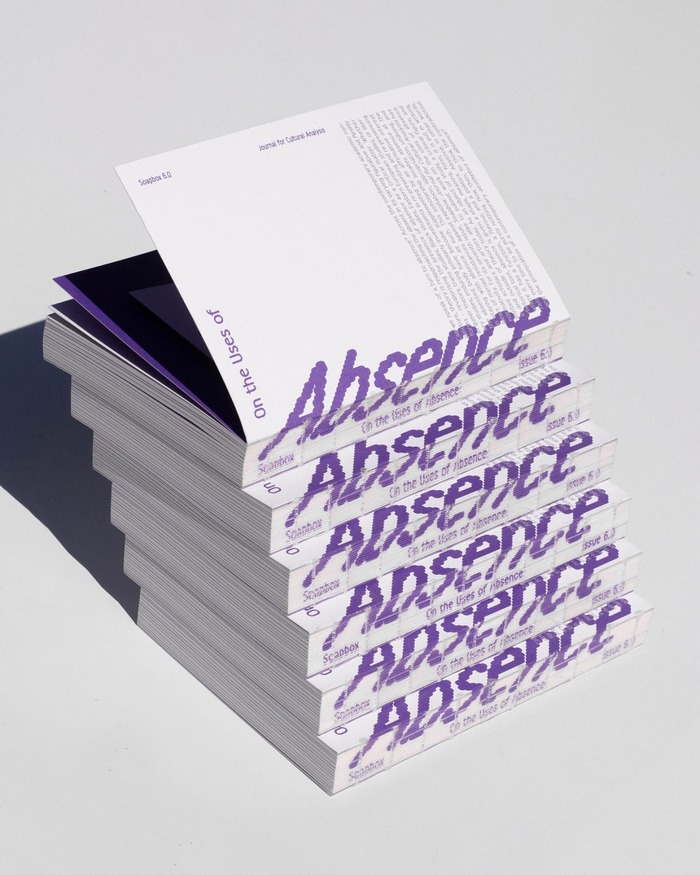
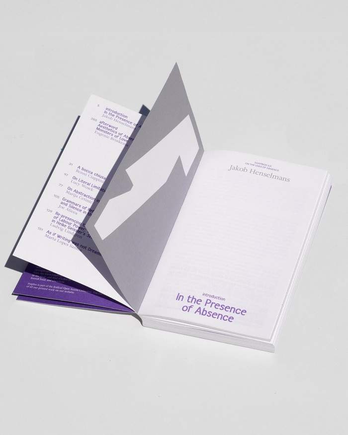
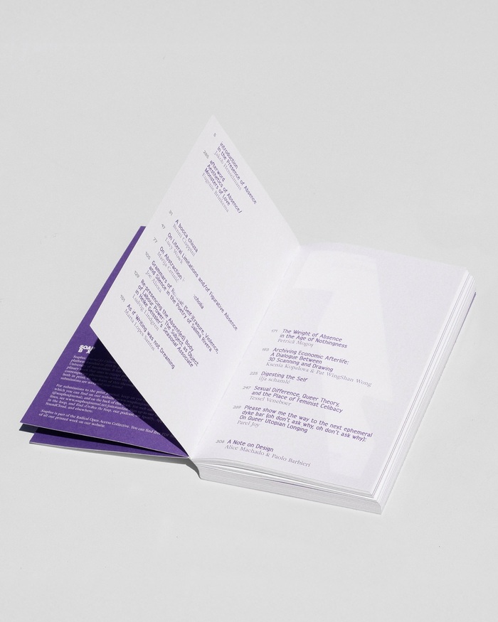
“On the Uses of Absence”is the title ofSoapbox, issue 6.0: Can we speak of a turn to absence? Across the contemporary academic conjuncture, theory is reapproaching the absent in its varying figurative and fleshly forms – revalorising the presence of absence as a critical matter. Whether in queer theory, trans studies, Black studies, Eastern European studies, or literary studies, enduring scholarly investments in re-presenting and re-presencing the absented body have become supplemented by an affirmative interest in staying with absence as such. This scholarship locates absence at the heart of myriad resistances against exploitation, appropriation, undoing, and normativity. For its seventh issue,Soapbox: Journal for Cultural Analysishas invited scholars and artists alike to submit work on the uses of absence in and outside of theory today. As an object of study, a critical figure, and rhetorical tool, absence is given a shape, meaning, form; it is put in writing, where it has a function, a flavour, and a politics. Absence, in other words, fails every time to be purely nothing. How, then, to think the contradiction and the provocation of a contemporary aesthetics of absence? The graphic design was made byAlice MachadoandPaolo Barbieri. They usedAdriane TextbyMarconi Lima,HarberbyBenoît BodhuinandModulo– an uncredited and unreleased design byNebiolo, used here in a version byAlessio D’EllenaandAlberto Malossi.
This typography system embodies intellectual provocation through structural contradiction—the rational authority of Adriane Text's high-contrast forms creates academic gravitas, while Harber's dynamic apertures and Modulo's geometric construction introduce deliberate instability. The bouncing baselines and rotated elements literalize the journal's exploration of "absence," creating a visual rhetoric where typographic displacement becomes conceptual content.
Adriane Text serves as the rational anchor with its vertical stress and closed apertures establishing scholarly authority, while Harber's dynamic form model introduces warmth and accessibility that prevents academic coldness. Modulo's geometric construction provides systematic clarity for navigational elements. The pairing creates productive tension between traditional academic typography (high-contrast serif) and contemporary editorial experimentation (sans with open forms), perfectly suited for a journal interrogating theoretical boundaries.
This tri-font system violates conventional pairing wisdom by spanning all three form models—rational (Adriane Text), dynamic (Harber), and geometric (Modulo)—yet succeeds through shared proportional relationships and careful hierarchical deployment. Rather than structural harmony, the designers embrace deliberate typographic friction that mirrors the journal's theoretical project of "staying with absence," where displacement and contradiction become productive tools rather than problems to solve.