
Harber follows a rational construction model with vertical stress and controlled apertures, creating an orderly, systematic appearance that prioritizes clarity over warmth. The stroke contrast is minimal to absent, maintaining uniform weight throughout letterforms in the tradition of neo-grotesque sans-serifs. Its distinguishing features include tightly controlled counters, a moderate x-height that balances readability with compactness, and terminals that are cleanly cut without humanist flourishes. This typeface belongs to the contemporary display sans tradition, departing from classical grotesque models through refined proportions and optical corrections that suggest digital-first design priorities. Harber excels as a headline and display face where its rational authority can command attention without competing details, but its uniform stroke weight and controlled forms may create monotonous texture in extended text settings. The personality it brings to the page is one of professional competence and systematic thinking, making it particularly suited for corporate communications, tech branding, and editorial contexts that require clear hierarchy without decorative distraction.
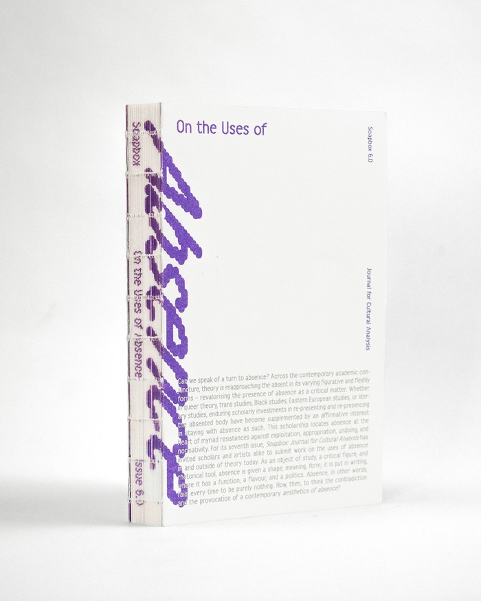
Soapboxissue 6.0, “On the Uses of Absence”
This typography system embodies intellectual provocation through structural contradiction—the rational authority of Adriane Text's high-contrast forms creates academic gravitas, while Harber's dynamic apertures and Modulo's geometric construction introduce deliberate instability. The bouncing baselines and rotated elements literalize the journal's exploration of "absence," creating a visual rhetoric where typographic displacement becomes conceptual content.
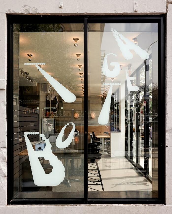
Bottega
Harber's dynamic form model with open apertures and diagonal stress creates an approachable warmth that speaks to authentic Italian hospitality, while its variable weight range allows for kinetic expression that mirrors the "constantly moving and changing" community energy. The pairing with Montiac's more rational structure provides grounding stability, suggesting a neighborhood institution that's both welcoming and dependable—perfectly capturing the mom-and-pop Italian café positioning in diverse Crown Heights.