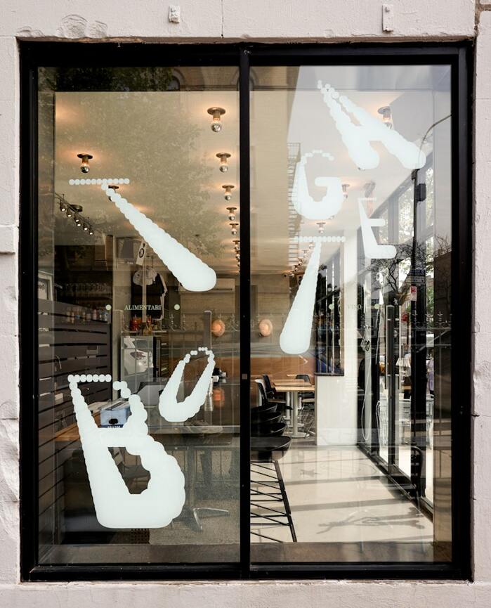
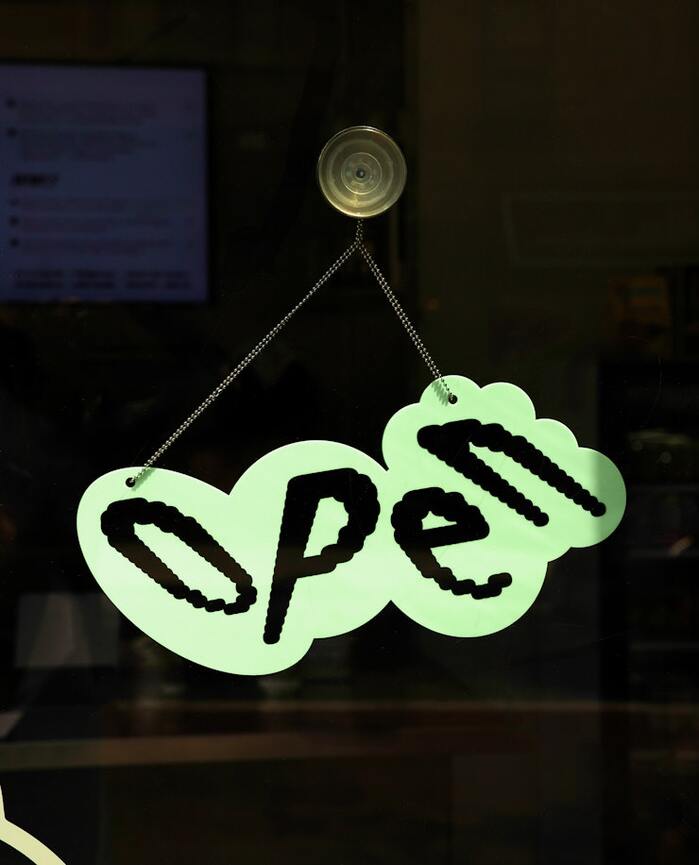
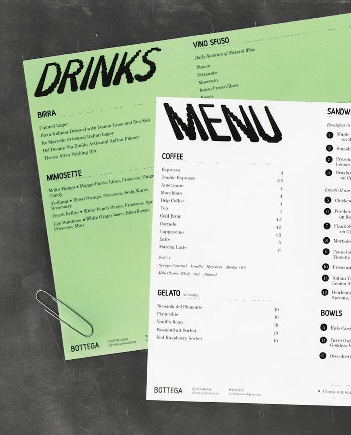
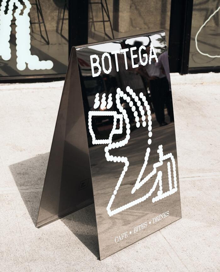
Brand identity and environmental graphics forBottega, the mom-and-pop Italian café based in Crown Heights, Brooklyn.PentagrampartnerAndrea Trabucco-Camposand team developed a new visual identity and signs with an inviting, dynamic, yet elegant attitude. Even in static form, the identity conveys an active space, constantly moving and changing, much like the diverse Crown Heights community that Bottega is now a part of. The design usesHarberbyBenoît Bodhuin, paired withMontiacbyFabiola Mejía.
Harber's dynamic form model with open apertures and diagonal stress creates an approachable warmth that speaks to authentic Italian hospitality, while its variable weight range allows for kinetic expression that mirrors the "constantly moving and changing" community energy. The pairing with Montiac's more rational structure provides grounding stability, suggesting a neighborhood institution that's both welcoming and dependable—perfectly capturing the mom-and-pop Italian café positioning in diverse Crown Heights.
Harber's dynamic characteristics—open counters, humanist proportions, and calligraphic stress—immediately communicate craft and approachability essential for a neighborhood café, while its variable font capabilities enable the animated, gradient effects that bring the "active space" concept to life across environmental graphics. Montiac's rational structure with tighter apertures provides necessary contrast and hierarchy for menu pricing and signage legibility, creating a pairing that balances warmth with functional clarity across diverse touchpoints from storefront to tray liners.
This pairing follows contrast-with-cohesion principles by crossing form models—dynamic Harber with rational Montiac—while maintaining compatible humanist proportions and similar x-heights. The structural tension works because both fonts share moderate contrast levels and avoid extreme stylistic flourishes, allowing Harber's warmth to lead brand personality while Montiac provides typographic discipline for information hierarchy and extended reading contexts like menus.