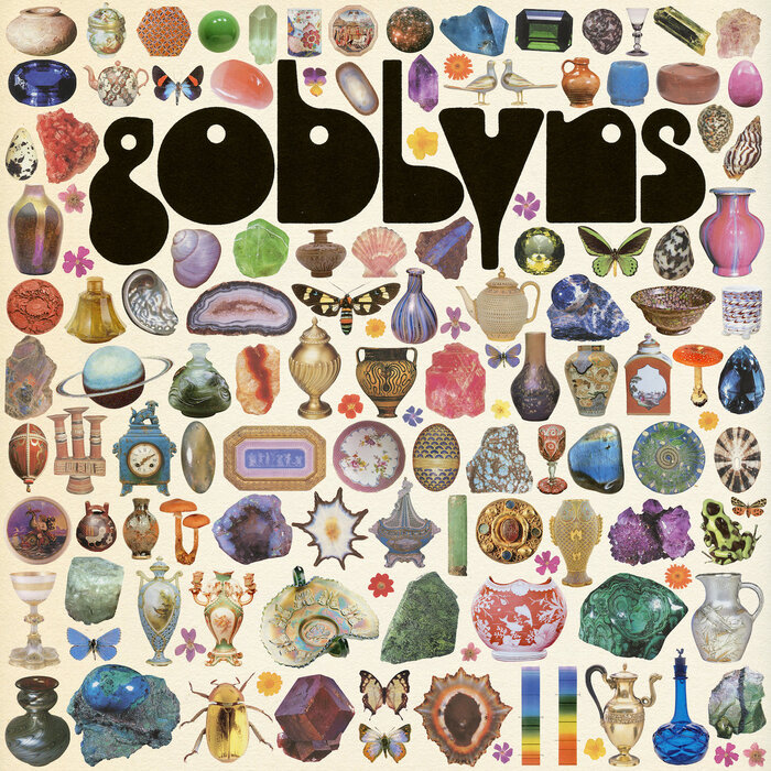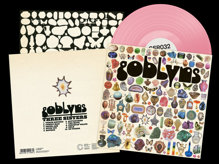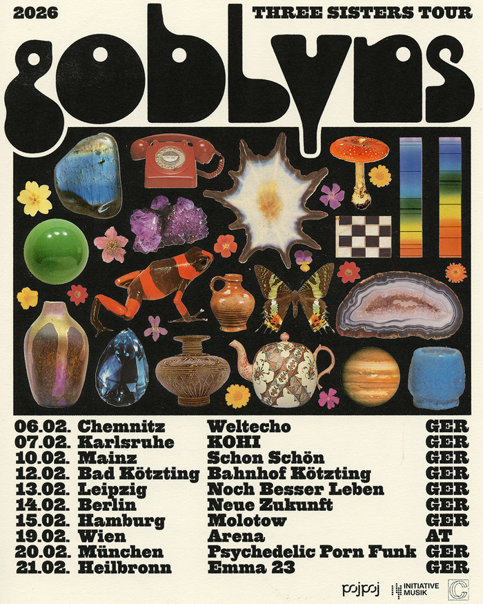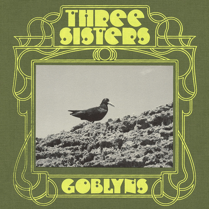


Three Sistersis the second studio album by the Berlin-based bandGoblyns. It was recorded at Junxt Berlin, mastered at Songololo Studios and released in June 2025 byCrazysane Records. The artwork and design was made byJulia SchimautzatDTAN Studio. Additional information and images about the design process can be found on thisInstagram postmade by the artist (including a Risograph printed poster of a taller version of the album cover’s illustration, with more objects). HypnosbyJean Alessandriniis used for the band’s name. It is accompanied by a version ofQuadra 57(probablySpadefromCanada Type) for the titles of album and tracks on the back of the record, as well as the dates on the tour poster.Another visual was made by Julia Schimautz for the single cover for an earlier digital release of the album’s title track in April 2025 (with the participation ofDay Day Contemporaryscreen printing studio for exposing a screen used for the design). More information about this image can be found on thisInstagram post. Shotgunwas used for both the band name and song title on the single cover. Vinyl record showing the backside usingHypnosas well asSpadefor the album & tracks titles. What really pulls the artwork together for me is the typeface ‘Hypnos’ by Jean Alessandrini, originally created in the ’70s. It’s currently being digitized, but we had the honor of using it before its official release. Thank you so much, Jean & Oliver! Désireux de les actualiser, de les valoriser et de les diffuser, il collabore avec Olivier Nineuil, dessinateur de caractères, en vue de leur numérisation. Eager to update, enhance, and disseminate them, he collaborated with Olivier Nineuil, a type designer, with a view to digitizing them.
Hypnos delivers a distinctly analog, psychedelic authority through its bold geometric construction and extreme contrast ratios. The typeface channels 1970s counterculture sophistication—not throwback nostalgia, but the era's experimental rigor applied to letterforms. Its dynamic form model features open apertures and diagonal stress that create warmth within an otherwise systematic structure, perfectly embodying the band's position between underground credibility and refined artistic vision.
Hypnos operates as a dynamic-geometric hybrid, featuring constructed letterforms with calligraphic warmth through its diagonal stress and open counters. The extreme contrast between thick and thin strokes creates visual impact at display sizes while maintaining legibility, essential for album packaging. Paired with Spade's rational grotesk forms for secondary information, the system creates hierarchy through structural differentiation—the serif's organic curves against the sans's vertical precision—rather than mere weight variation, ensuring both fonts serve distinct but complementary roles.
The Hypnos-Spade pairing follows contrast-with-cohesion principles, sharing similar x-height proportions and weight distribution while diverging in their form models. Hypnos's dynamic diagonal stress contrasts beautifully with Spade's rational vertical structure, creating typographic tension that mirrors the band's musical complexity. The switch to Shotgun for the single cover disrupts this harmony intentionally, suggesting different release formats deserve distinct typographic treatments within the broader brand architecture.