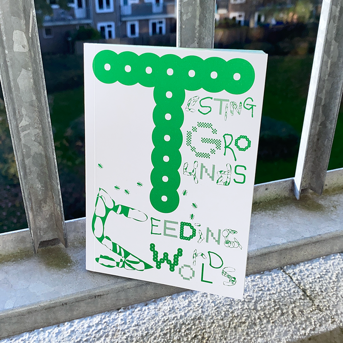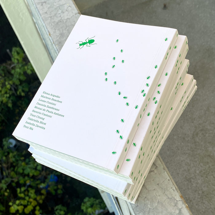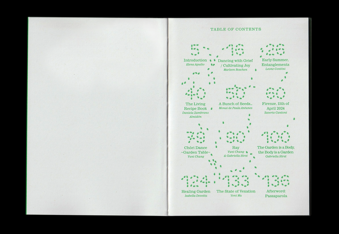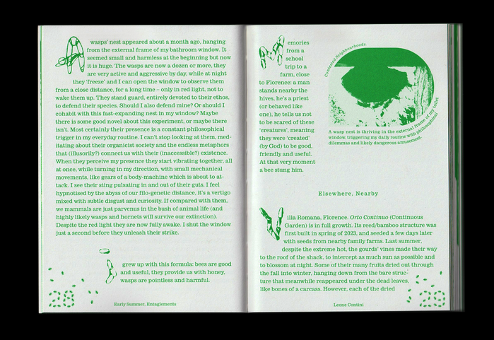


An assemblage of artistic reflections and perspectives that grew through and together with the collective experiences of inhabiting a garden inVilla Romana, Firenze. The book design usesOuvrièresbyLaure Azizi(in affamées and agricultrices styles),GrancybyMinjong Kim,BianZhiDai(in Base and Ring styles) andKiddobynotyourtypefoundry,FA_AAAIEMOADDPandFA_PTGWDOBSHKbyFull Auto Foundry, andOPS CubicbyOPS Type.Lincoln/MITREwas used as well, but isn’t shown in the images.
This typography creates an experimental-scholarly ecosystem that mirrors the organic complexity of a garden laboratory. The deliberate multiplicity of foundries and styles—from Velvetyne's activist roots to notyourtype's experimental forms—generates a living typographic biodiversity that refuses traditional academic hierarchy. Rather than seeking typographic monoculture, this system embraces productive chaos, where each font contributes its own formal DNA to create a contemplative yet disruptive intellectual environment.
This radical multi-font approach operates through foundry curation rather than traditional pairing logic, creating typographic biodiversity that mirrors the book's garden metaphor. The selection spans form models—from Grancy's geometric clarity to Ouvrières' dynamic warmth to the constructed playfulness of OPS Cubic—deliberately breaking Kupferschmid's harmony rules to create productive tension. Each typeface maintains its structural integrity while contributing to a larger ecosystem, with contrast levels and aperture treatments varying wildly to prevent any single voice from dominating the scholarly discourse.
This isn't traditional pairing but typographic ecology—multiple form models (dynamic Ouvrières, rational academic traditions, geometric experimentation) coexisting without reconciliation. The approach violates conventional pairing wisdom by mixing incompatible structural systems, yet succeeds by treating typography as intellectual landscape rather than hierarchical communication. The deliberate discord creates space for contemplation, where readers must navigate between different typographic territories, mirroring the book's theme of collective inhabitation and artistic reflection.