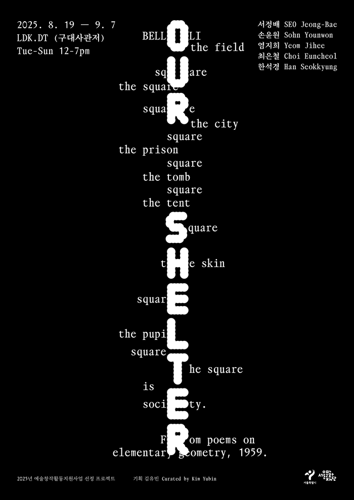


Our Shelteris an exhibition that took place in Seoul. It explores “shelter” as a threshold between life and death, where — artists turn enduring images and ritual acts into encounters with ruins, memory, and the living presence of the dead. The exhibition ran from August 19th to September 7th, 2025. It was hosted and curated by Kim Yubin atLDK.DT. The graphic design for the exhibition is byPassage Group. It utilises two distinct typefaces: for the title,OO TheranbyLaura Csocsán(released onOutline Online) and, for the smaller texts,TaktbyJanis Gildein, sometimes paired with a yet unidentified Korean Myungjo typeface [edit: it’sEulyoo1945byMingoo Yoon, see comments].
The typography creates a liminal, contemplative energy that mirrors the exhibition's threshold concept between life and death. OO Theran's geometric-rational form model with its constructed letterforms establishes architectural gravity, while the tight x-height and closed apertures create an inward, meditative quality. The pairing with Takt's more open, humanist proportions softens this severity, creating a duality that embodies the exhibition's exploration of shelter as both protection and boundary.
OO Theran's geometric construction with rational undertones serves the exhibition's architectural metaphors perfectly—its systematic letterforms echo the structural nature of "shelter" while maintaining the gravity needed for cultural discourse. The closed apertures and vertical stress create authority without warmth, appropriate for contemplating mortality. Takt provides necessary contrast through its dynamic form model with more open counters and diagonal stress, creating hierarchy through structural differentiation rather than mere scale. The inclusion of Eulyoo1945 adds Korean Myungjo's traditional authority, grounding the contemporary geometric forms in cultural context.
This is a sophisticated three-way structural conversation: geometric-rational (OO Theran) paired with dynamic-humanist (Takt) creates deliberate tension that reflects the exhibition's liminal themes. The addition of Eulyoo1945's traditional Myungjo forms introduces a third voice—cultural authority through classical Korean typography. Rather than following Kupferschmid's harmonious pairing rules, this system deliberately spans form models to create meaningful friction, with each typeface representing different temporal and cultural perspectives on shelter and memory.