
OO Theran
OO Theran follows a geometric form model with constructed circular 'o' forms and systematic proportional relationships, though it avoids the extreme mathematical rigidity of pure geometric faces like Futura. The typeface exhibits uniform stroke weight with no discernible contrast, creating the clean, even texture characteristic of neo-grotesque sans serifs. Its apertures are moderately closed, giving it a more serious, rational character than open humanist alternatives. The x-height appears well-balanced relative to the cap height, suggesting careful optical adjustment for text use. This face sits in the lineage of contemporary geometric grotesks that emerged in the digital era, sharing DNA with faces like Avenir and Proxima Nova but with a slightly more condensed set width and tighter spacing. In practice, OO Theran delivers the systematic clarity that geometric construction promises while maintaining enough warmth to avoid feeling cold or mechanical. However, the lack of italic styles severely limits its typographic flexibility, making it unsuitable for complex editorial work where emphasis and hierarchy are crucial.

A Magazine Curated By#28, Cecilie Bahnsen
This tri-font system creates an intimate yet intellectually rigorous editorial voice that balances contemporary design discourse with personal storytelling. OO Theran's monospaced DNA brings digital vernacular authenticity, while its distinctive circled alternates add playful punctuation. Mercure's rational proportions ground longer texts with scholarly authority, while Monument's geometric precision provides contemporary editorial backbone without coldness.
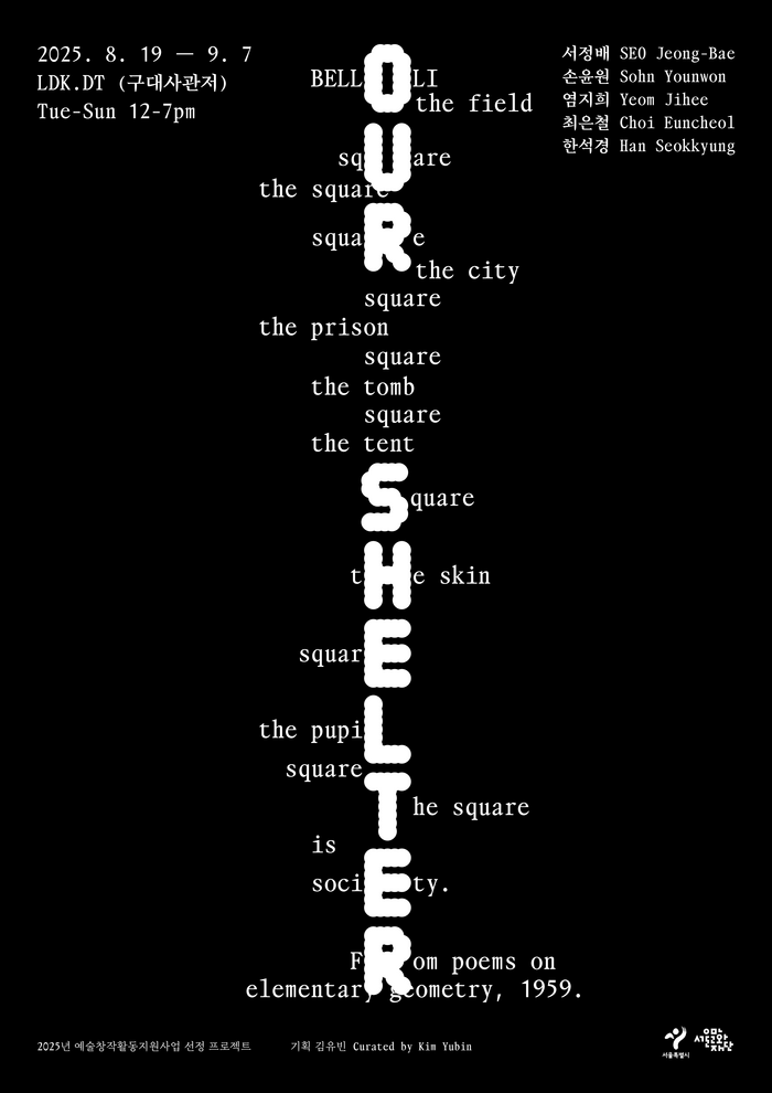
Our Shelterexhibition at LDK.DT
The typography creates a liminal, contemplative energy that mirrors the exhibition's threshold concept between life and death. OO Theran's geometric-rational form model with its constructed letterforms establishes architectural gravity, while the tight x-height and closed apertures create an inward, meditative quality. The pairing with Takt's more open, humanist proportions softens this severity, creating a duality that embodies the exhibition's exploration of shelter as both protection and boundary.
OHAYŌexhibition poster
This typography creates experimental-institutional energy that bridges academic rigor with avant-garde cultural expression. HAL Magic's geometric construction provides rational clarity for information hierarchy, while OO Theran's dot-matrix Black weight delivers raw digital materiality that transforms the title into a pixelated artifact. The combination suggests forward-thinking pedagogy that embraces both systematic thinking and experimental processes.