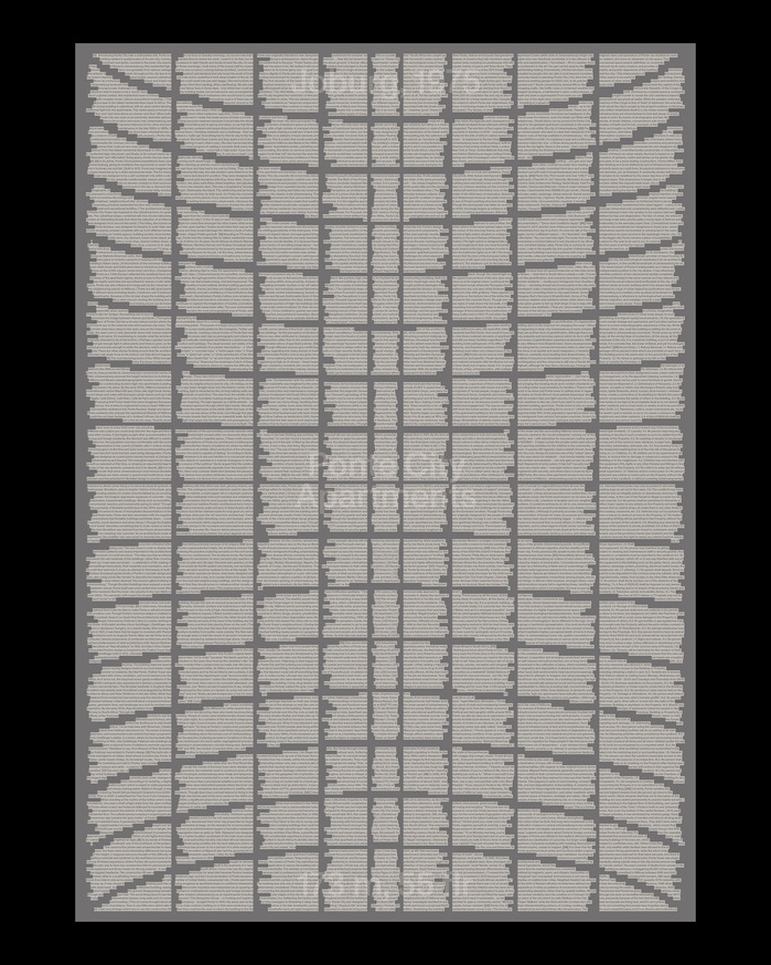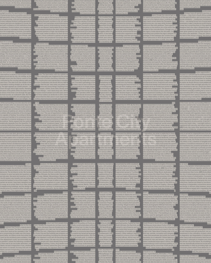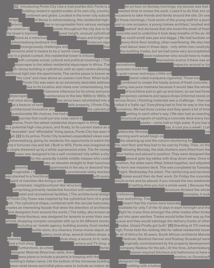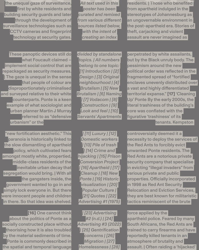


Experimental typographic poster with every piece of information I could find onPonte City Apartments.The challenge was to create an A0 poster packed with information about only one topic using mainly typography. I dove into the world of Africa’s tallest residential building – a massive cylindrical structure from 1975 in Johannesburg, full of mystery and historical significance, that I wanted to convey through type.Designed with a dual purpose, the poster works both as a physical reference, letting you read everything about the building – from its social and cultural significance to its role as a symbol of resilience – and as an immersive experience, placing you at the center of the “hole.” Divided into 30 topics under a single type weight, the text forms the shape of the façade as if seen from the inside, with context and key information at the center, maximizing the large format and creating a sense of depth.By carefully working with the text partitions, I developed a deliberate sense of false symmetry. The left, center, and right sections follow different alignments, creating subtle quirks that keep the composition dynamic, while the jagged edges of the text echo the building’s raw concrete texture and sense of decay. This approach reinforces the structure’s character, turning the dense typographic layout into an extension of the architecture itself, where precision and irregularity coexist to reflect both its monumental presence and its worn, lived-in history.785 sentences, 13,994 words, 86,694 characters, 841×1,189 mmProject developed in the typography module of the Master in Visual Design at Elisava.
ABC Monument Grotesk embodies architectural brutalism translated to type—its rational form model with closed apertures and vertical stress creates monumental authority that mirrors Ponte City's concrete monumentality. The typeface's systematic construction and industrial precision capture the building's 1975 modernist ambition while its slightly condensed proportions and sturdy weight echo the tower's imposing cylindrical mass and raw materiality.
Monument Grotesk's rational geometric construction perfectly parallels Ponte City's brutalist architecture—both are systematic, monumental, and uncompromising. The closed apertures and vertical stress axis create the typographic equivalent of poured concrete, while the family's range allows for subtle hierarchy without breaking the architectural metaphor. The condensed proportions maximize information density on the A0 format while maintaining the structural integrity needed to literally build the building's façade through text arrangement.
Working within Monument Grotesk's single family creates internal hierarchy through weight and size variation rather than contrasting typefaces—a choice that reinforces the architectural metaphor of a monolithic structure. This mono-family approach mirrors brutalist architecture's material honesty, where variation comes from the manipulation of a single material (concrete) rather than mixing materials. The systematic weight range provides functional hierarchy while maintaining the poster's conceptual unity as a typographic building.