ABC Monument Grotesk
Monument Grotesk exhibits a rational form model with closed apertures, vertical stress axis, and systematic construction that prioritizes authority over approachability. The contrast is nearly nonexistent, maintaining uniform stroke weights throughout that create an even, industrial texture on the page. Distinguishing features include tightly closed counters in letters like 'e' and 'a', squared-off terminals, and a notably condensed set width that maximizes character count per line. This face belongs to the neo-grotesque tradition but pushes toward brutalist territory with its uncompromising geometric rigidity and rejection of humanist warmth. In practice, Monument Grotesk excels at creating stark, commanding headlines where its condensed proportions and rational authority serve architectural and luxury brands well, but its closed forms and tight spacing make it unsuitable for sustained reading at text sizes.
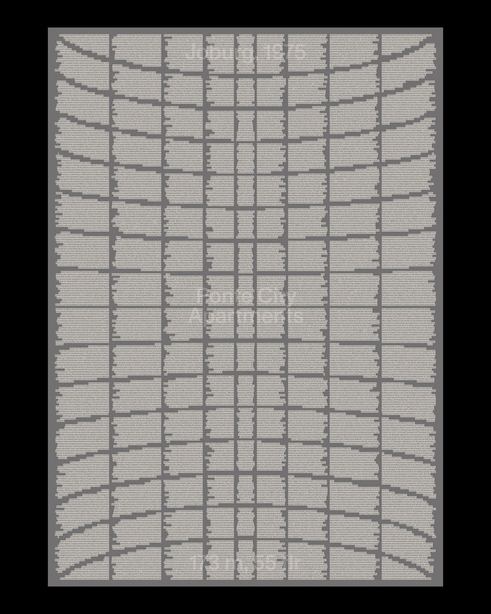
Ponte City Apartments poster
ABC Monument Grotesk embodies architectural brutalism translated to type—its rational form model with closed apertures and vertical stress creates monumental authority that mirrors Ponte City's concrete monumentality. The typeface's systematic construction and industrial precision capture the building's 1975 modernist ambition while its slightly condensed proportions and sturdy weight echo the tower's imposing cylindrical mass and raw materiality.

A Magazine Curated By#28, Cecilie Bahnsen
This tri-font system creates an intimate yet intellectually rigorous editorial voice that balances contemporary design discourse with personal storytelling. OO Theran's monospaced DNA brings digital vernacular authenticity, while its distinctive circled alternates add playful punctuation. Mercure's rational proportions ground longer texts with scholarly authority, while Monument's geometric precision provides contemporary editorial backbone without coldness.