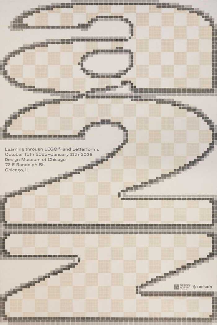

Exhibition poster announcinga projectthat was working with LEGO® bricks to letterpress print letterforms by different typedesigners and graphic designers from many places around the globe.The posters have also been letterpress printed from a total of 5,469 pieces of 1×1 LEGO bricks. The large outline type with the checkerboard gloss is a pixelated form ofUnivers93 Extra Black Extended. The main info has been cast fromLudlowhot metal slugs inRecord GothicBold Extended and the small bottom line was set in Record Gothic Bold.
This typography system embodies playful-industrial precision, bridging the gap between childhood construction and adult craft mastery. The pixelated Univers creates a digital-meets-analog energy that's both nostalgic and forward-thinking, while Record Gothic's sturdy letterforms echo the modular, stackable logic of LEGO bricks themselves. The combination communicates educational innovation with serious design intent—turning play into pedagogy through systematic construction.
Record Gothic's rational form model—with its closed apertures, vertical stress, and industrial weight—mirrors the precision engineering of LEGO manufacturing, making it the perfect choice for an exhibition celebrating modular construction. Univers 93's geometric foundation translates beautifully into pixel form, maintaining structural integrity even when reduced to brick-sized units. The high contrast between the massive pixelated display type and the dense, compact information hierarchy creates optical rhythm that mimics the scale relationships inherent in LEGO building—from individual brick to architectural form.
This pairing works through structural harmony rather than contrast—both fonts share rational form models with systematic construction principles. Record Gothic's industrial vernacular perfectly complements Univers' geometric modernism, creating a cohesive system where both fonts feel engineered rather than drawn. The real genius is in the treatment: pixelating Univers transforms it into a constructivist display face while maintaining its essential geometric DNA, creating hierarchy through process rather than just scale.