Record Gothic
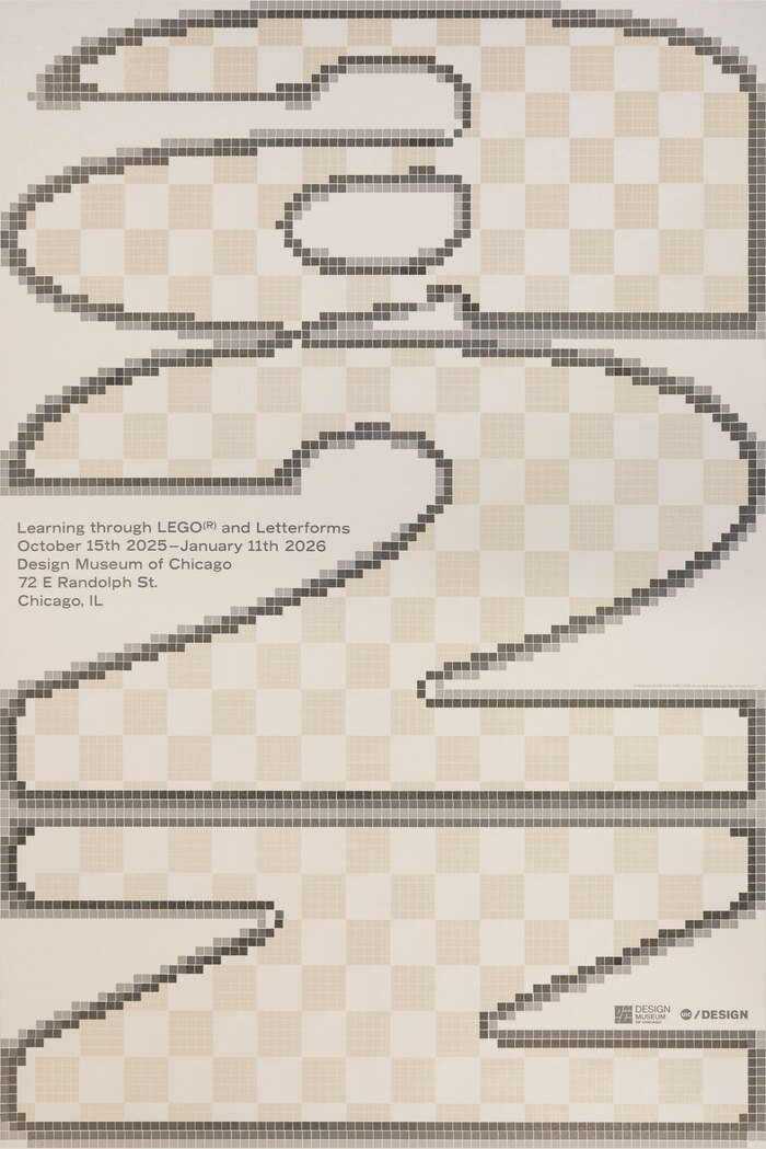
Record Gothic operates from a geometric skeleton with systematic letter construction, featuring circular 'o' forms and mathematical proportions that echo the industrial modernist tradition of early 20th century American gothics. The face exhibits minimal stroke contrast with uniform line weights throughout, creating the monotone color characteristic of workhorse sans-serifs designed for signage and utilitarian applications. Its closed apertures and compact letter spacing reflect the rational construction model, prioritizing legibility over warmth or approachability. The typeface belongs to the lineage of industrial gothics like Franklin Gothic and News Gothic, but with a more systematic, less humanized approach to letter forms. Record Gothic excels in environments requiring neutral, authoritative communication—corporate documentation, wayfinding systems, and technical applications where personality must be subordinated to clarity. However, its closed forms and lack of italic variants limit its expressive range, making it unsuitable for editorial contexts requiring typographic nuance or extended reading comfort.