
Univers
Univers embodies the rational form model with its closed apertures, vertical stress axis, and systematic construction that prioritizes order over warmth. The stroke contrast is nearly absent, creating the uniform typographic color characteristic of mid-century Swiss grotesques, while letterforms like 'a' and 'e' feature tightly closed counters that reinforce its reserved, institutional character. This is Adrian Frutiger's masterpiece of systematic type design, conceived as a complete family with mathematically derived weight and width variations that established the template for corporate modernism. Unlike Helvetica's more idiosyncratic details, Univers maintains absolute consistency across its extensive range, making it the Swiss Army knife of rational sans-serifs. It excels in environments demanding neutrality and systematic hierarchy—annual reports, wayfinding systems, technical documentation—but its closed forms and cool demeanor can feel sterile in contexts requiring human warmth. On the page, Univers delivers unflappable professionalism, though its tight spacing and closed apertures demand careful attention to sizing for optimal legibility.
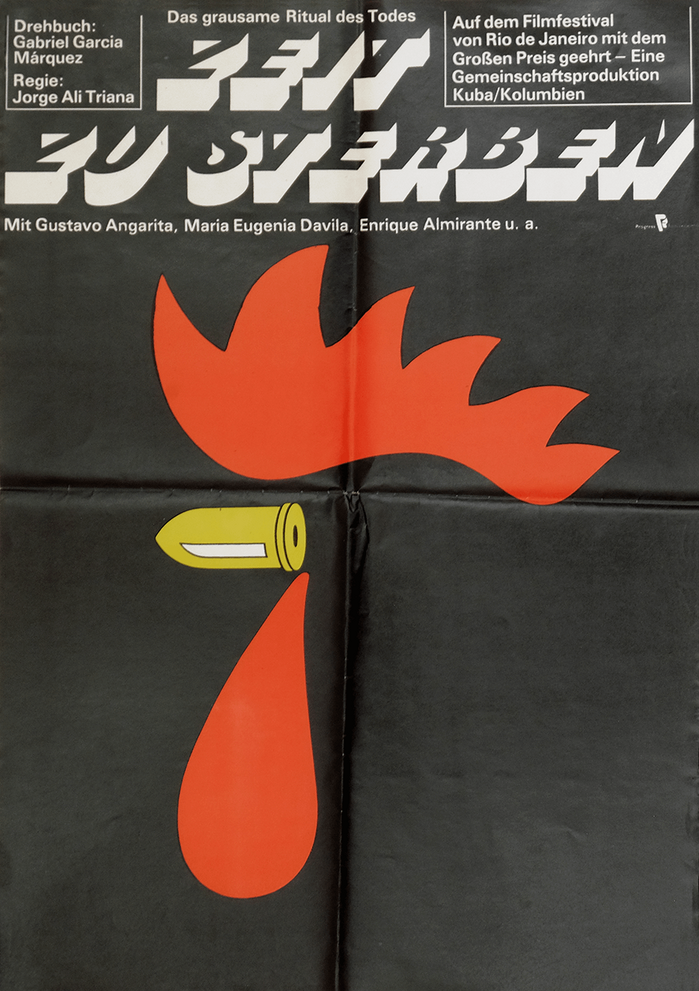
Zeit zu sterbenGerman movie poster
This typography system communicates existential gravity through mortuary monumentalism. Buster's carved, tombstone-like letterforms carry the weight of finality, while the rationalized structure suggests Germanic directness about mortality. The pairing creates a clinical fatalism—death presented not as romantic tragedy but as stark, inevitable fact.
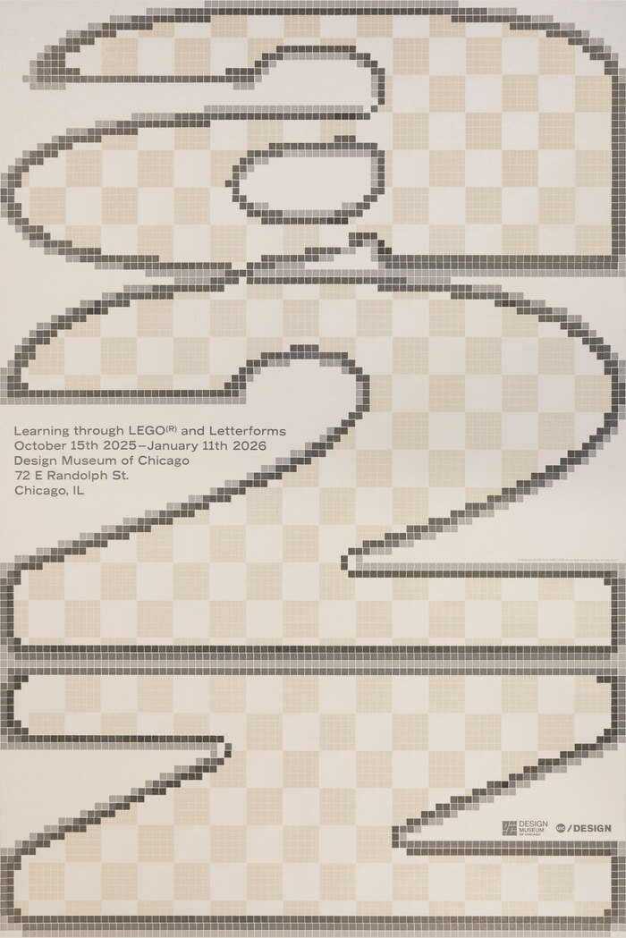
a–z: Learning through LEGO® and Letterformsposter
This typography system embodies playful-industrial precision, bridging the gap between childhood construction and adult craft mastery. The pixelated Univers creates a digital-meets-analog energy that's both nostalgic and forward-thinking, while Record Gothic's sturdy letterforms echo the modular, stackable logic of LEGO bricks themselves. The combination communicates educational innovation with serious design intent—turning play into pedagogy through systematic construction.