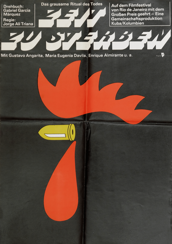

Zeit zu sterbenis the German title ofTiempo de morir, known in English as(A) Time to Die.The Colombian-Cuban co-production is based on a script byGabriel García Márquez. Directed byJorge Alí Triana, the film stars Gustavo Angarita, María Eugenia Dávila, Enrique Almirante, and Sebastián Ospina. The art on the poster for the East German release byProgress Filmsuggests a rooster’s head, with the beak depicted as a bullet. The tombstone-like letters for the title are fromBuster.
This typography system communicates existential gravity through mortuary monumentalism. Buster's carved, tombstone-like letterforms carry the weight of finality, while the rationalized structure suggests Germanic directness about mortality. The pairing creates a clinical fatalism—death presented not as romantic tragedy but as stark, inevitable fact.
Buster's carved stone aesthetic directly serves the film's mortality themes, with letterforms that reference both cemetery monuments and socialist brutalist architecture. The rational form model with its vertical stress and closed apertures creates authoritative weight without warmth. Univers provides clinical neutrality as supporting text, its geometric construction echoing East German design sensibilities while maintaining legibility against the more expressive display treatment.
This is a strategic contrast pairing across form models—Buster's carved rational forms against Univers' geometric precision. The fonts share similar x-height proportions and stroke weights, creating cohesion, while their surface expressions (carved vs. constructed) provide necessary hierarchy. The pairing avoids sentimentality through shared structural restraint, appropriate for socialist cinema's matter-of-fact approach to existential themes.