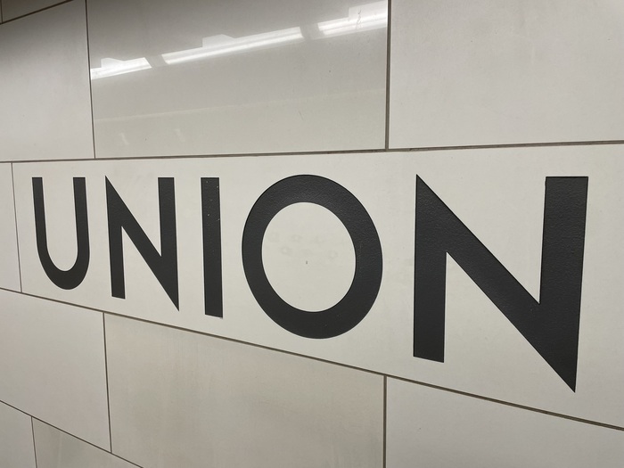
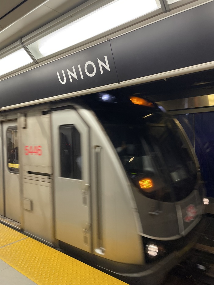
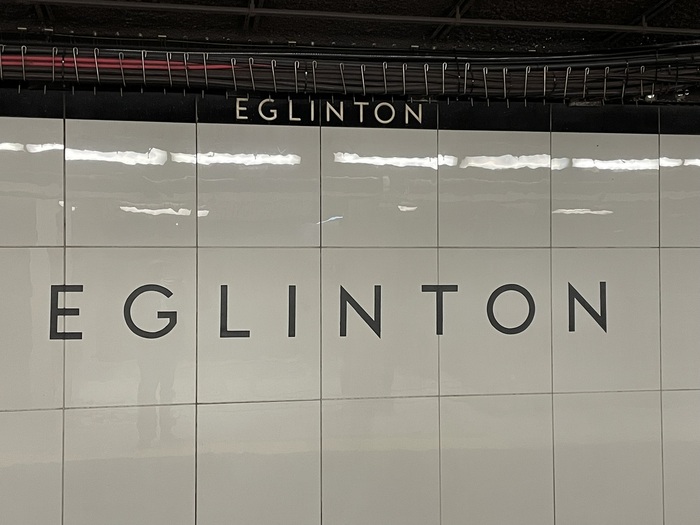
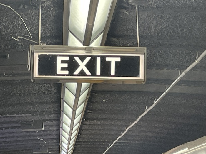
This geometric sans-serif typeface was designed for the original section of the Toronto Transit Commission’s (TTC) Yonge subway line. The typeface and TTC logo were developed during the construction of Line 1 Yonge–University in the 1940s,perhaps by draughtsman Philip Butt, but the original designer has never been determined. The font is composed of capital letters sandblasted into the tiles of Toronto subway stations opened between 1954 and 1974, as well as on signs. The sui generisToronto Subwayfont wasdesignedin 2004 byDavid Vereschagin, who visited stations, took photos, and made rubbings of the letters on the original Vitrolite glass tiles. Vereschagin also designed a matching lowercase, inspired byFuturaand similar designs. By 2007, “TTC wayfinding typography” was a case study in what not to do, confusing users and neglecting local typographic heritage by incorporating a jumble ofUnivers,Swiss 721andGill Sans, as documented by Joe Clark in apresentation to the 2007 ATypI conference. In 2013, the TTC created a design and wayfinding team who readopted the typeface, calling itBloor-Yongeafter the busy station at the intersection of two lines, and they began to re-apply it through the system. Lines recently built by the new regional transit authority, Metrolinx, only use the iconic typeface in some signage as a “decorative element.” Most wayfinding signage is in the new Metrolinx standard ofClearviewADA. The Union station signage shown is from the 2014 renovation and expansion. The Eglinton station signage is original to 1954 and is a lighter weight used this way only in one other station. The exit sign is also a first use from 1954. The St Andrew station and “PLEASE HOLD HANDRAIL” sign are from the first line extension in 1963. See also theToronto Transit Commission Signage and Wayfinding Standards(2023).
Toronto Station embodies civic permanence through its geometric construction and monumental capitals. The wide letterforms with generous spacing create institutional authority without coldness—the geometric model's systematic clarity conveys public trust and navigational certainty. The sandblasted execution in tiles transforms individual letters into architectural elements, making typography inseparable from urban infrastructure and creating a distinctly Canadian modernist voice that feels both progressive and enduring.
The geometric form model serves transit wayfinding perfectly through its constructed clarity and high legibility at distance. The wide proportions and open counters ensure readability in underground lighting conditions, while the all-caps treatment creates uniform visual rhythm across varied message lengths. The systematic character construction typical of geometric sans-serifs provides the consistency essential for wayfinding systems, where users need instant recognition and trust in the information hierarchy.
As a single-font system, Toronto Station creates hierarchy through weight variation and scale rather than typographic contrast. The original lighter weight (seen at Eglinton) demonstrates the font's range, while consistent spacing and proportions maintain system cohesion. The geometric form model's inherent modularity allows effective scaling from small directional signs to large station identifiers, with the sandblasted tile execution adding tactile dimension that reinforces the typography's architectural integration.