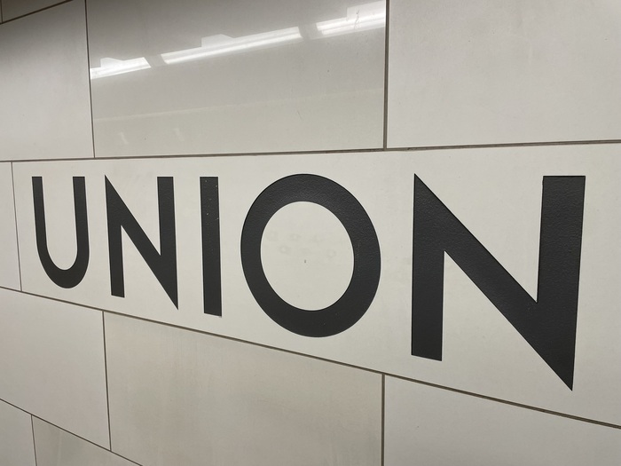
Toronto Station
Toronto Station follows a geometric form model with systematic construction built on circular and rectangular foundations, though it departs from pure geometry with industrial-influenced letterforms that reference transit signage and architectural lettering. The typeface exhibits no stroke contrast, maintaining uniform weight throughout, with a vertical stress axis that reinforces its rational, authoritative presence. Its distinguishing features include a moderate x-height relative to cap height, closed apertures that create a serious demeanor, and terminals that are cleanly cut without flourish. The counters are reasonably open despite the closed aperture design, suggesting careful attention to legibility within its industrial aesthetic. This face belongs to the tradition of mid-20th century transport and wayfinding typography, drawing DNA from systems like Johnston Underground and Frutiger, but pushes toward a more utilitarian, working-class character that evokes subway tiles and cast iron signage. Toronto Station excels in large-scale applications where its systematic geometry and industrial authority can command attention, but its closed apertures and likely fine details would struggle at text sizes, making it a specialist for headlines, signage, and brand applications that need to project urban competence and unpretentious functionality.