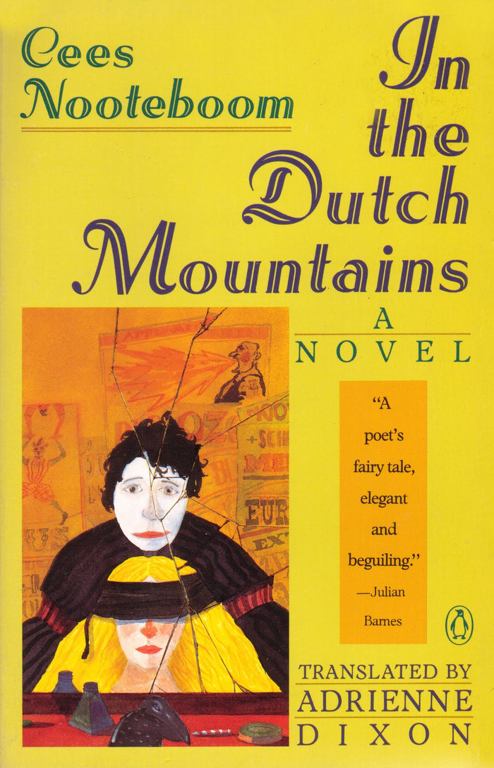
In Nederland(“In the Netherlands”) is a novel by Dutch writerCees Nooteboom. A morose provincial inspector of roads in Aragon settles down to write the fable ofthe Snow Queen. The Netherlands has now been stretched into a vast country with Northern flatlands and hazardous Alpine ranges in the south. Kai and Lucia are circus illusionists, and when Kai is kidnapped, Lucia must rescue him from the Snow Queen’s palace.In the Dutch Mountainsis an elegantly constructed story within a story, laced with the wit that characterises the work of this outstanding European writer. First published in Dutch byDe Arbeiderspersin 1984, it was translated to the English byAdrienne Dixon(1932–1990) and published byLouisiana State University Pressin 1987, under the titleIn the Dutch Mountains. Shown here is the cover ofPenguin’s paperback edition from 1991, with cover art byDavid Davies. The design is byMelissa Jacoby. For title and author’s name, she chose a typeface that was released around 1932 – shortly before Nooteboom was born (1933): it’s Schwung-Adastra, an extension ofAdastra(1928) with swash caps. The inclined inline face was cut by August Rosenberger at theStempelfoundry in Frankfurt, after designs byHerbert Thannhaeuser. Outside Germany, Adastra was also known asRoyal. Cees Nooteboomdied 11 February 2026at the age of 92. RIP.
Adastra's inclined inline construction with swash capitals creates a theatrical, old-world literary elegance that perfectly captures the fantastical yet melancholic spirit of Nooteboom's nested narrative. The dynamic form model—with its open apertures and diagonal stress—combined with the decorative inline treatment suggests both the whimsy of circus illusionists and the gravitas of European literary tradition, bridging entertainment and high culture in a way that mirrors the novel's story-within-a-story structure.
Adastra's 1928 origins and swash extension from 1932 create perfect temporal resonance with Nooteboom's birth year (1933), establishing an authentic historical voice for this translation of Dutch literature. The dynamic form model with diagonal stress and open apertures provides warmth and accessibility essential for paperback fiction, while the inline construction and inclined posture add theatrical flair appropriate for a tale of circus performers and fairy tale archetypes. The decorative swash capitals elevate the humble paperback format with European sophistication.
While only Adastra is prominently featured for display, the pairing with what appears to be a rational body text face (likely a simple serif for the blurb) follows sound hierarchical principles. The dynamic display face provides personality and voice while allowing the rational text face to deliver information clearly. This creates the essential contrast-with-cohesion needed for book cover typography—the display draws readers in with character while the body text provides necessary context without competing for attention.