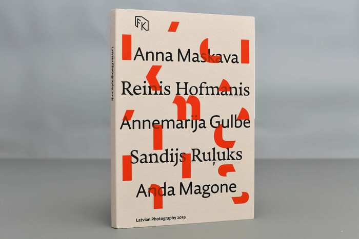
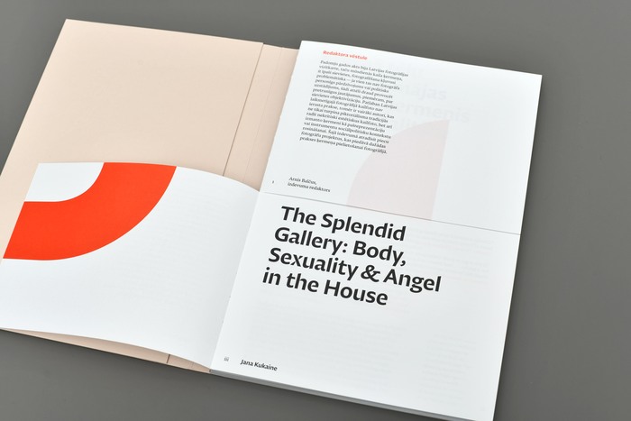
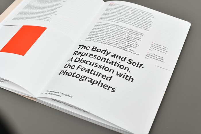
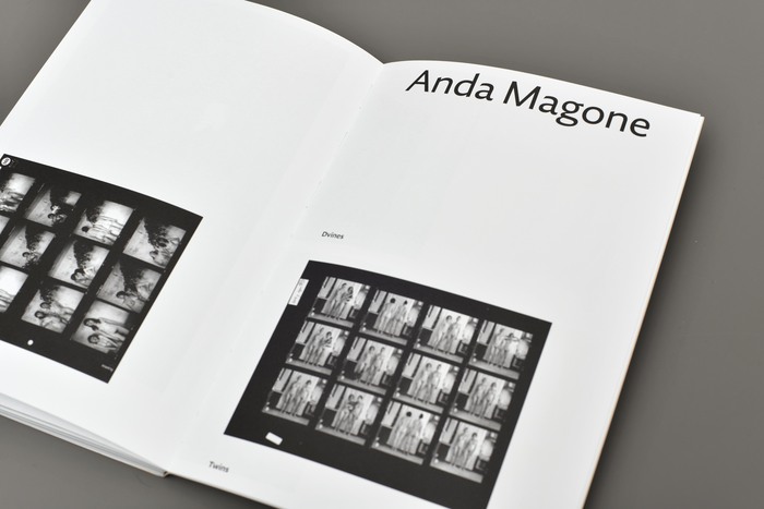
This bilingual yearbookshowcases contemporary Latvian photographers and significant exhibitions at theLatvian Museum of Photographyin Riga. Designer Alexey Murashko selected three typefaces byNikola Djurekfor the book:Diurnal Displayfor the titles,Nocturnofor the main text, andDiurnalfor the marginalia. The book is cut horizontally in half, with the lower part containing the English text and the top part containing the Latvian text. This system allows the pages to be flipped independently and creates unexpected compositions.
This typography system embodies intellectual rigor with experimental structure, reflecting the avant-garde nature of contemporary Latvian photography. The combination of Djurek's rational forms with their precise optical sizing creates a scholarly authority that's disrupted by the book's deconstructed horizontal division, suggesting both archival permanence and cutting-edge cultural intervention.
Djurek's Diurnal family operates within a rational form model with closed apertures and vertical stress, providing the editorial gravitas essential for museum documentation. The optical sizing distinction between Diurnal and Diurnal Display ensures proper contrast relationships across hierarchies, while Nocturno's slightly more open character softens the text experience without abandoning the rational framework. This systematic approach supports the bilingual complexity while maintaining typographic coherence across the fragmented layout.
This is a masterclass in optical sizing strategy rather than traditional font pairing. All three fonts share Djurek's rational form model and consistent proportional DNA, creating perfect structural harmony. The differentiation comes through optical refinement—Display for impact, regular Diurnal for functional hierarchy, and Nocturno for sustained reading. This approach allows the radical horizontal book division to work without typographic chaos, as the fonts maintain unity while serving distinct functional roles.