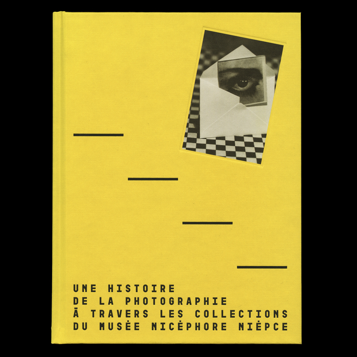
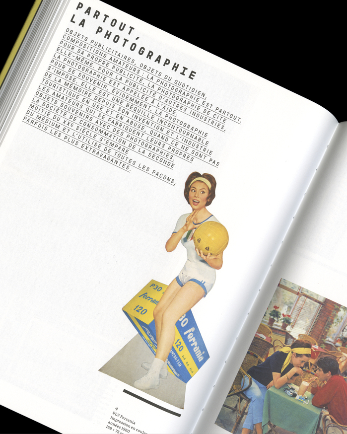
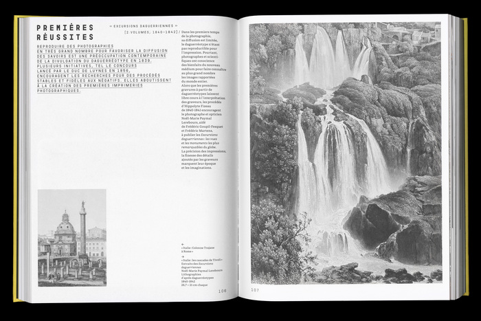
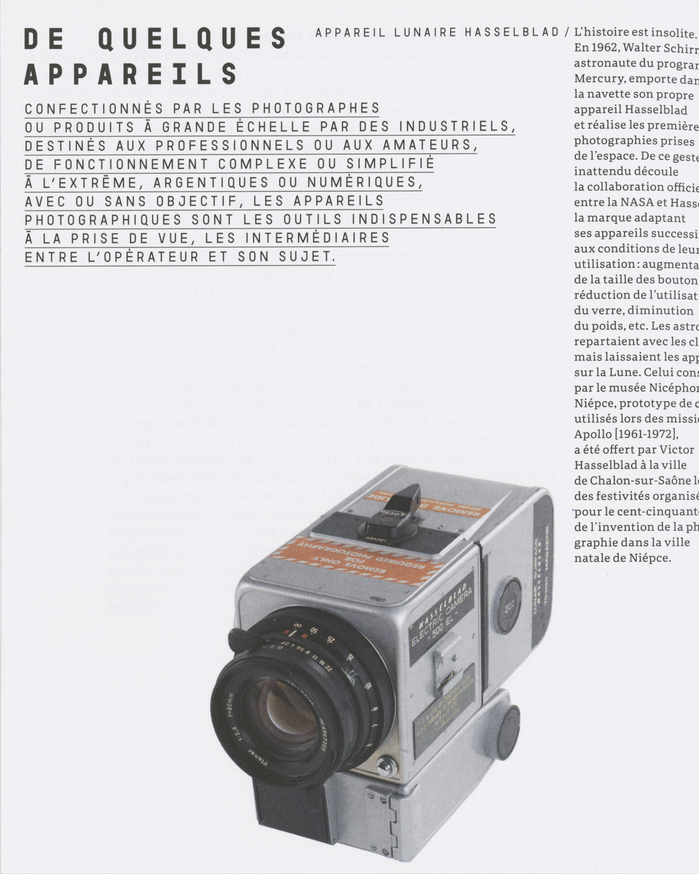
This work traces the history of photography from its invention in 1827 to its contemporary uses, through the collections of theNicéphore Niépce Museum, which comprise four million photographs, 8,000 cameras, and 30,000 magazines and technical or illustrated books. Off the beaten path, it presents an “alternative history” of photography, focusing on the richness of the medium in the diversity of its techniques, artistic movements, and modes of dissemination. It documents the social, documentary, and commercial dimensions of photography from its origins. Deliberately heterogeneous and quasi-encyclopedic, it bears witness to the many paths taken by photography. The design of this publication, published byÉditions Textuel, was entrusted to the French graphic designerLe Petit Didier. He chose the typefaceGaraje(withGaraje Mono, byThomas Huot-Marchand,205TF) for headings and subheadings, and the typefacePortada Text(José ScaglioneandVeronika Burian,TypeTogether) for body text and captions.
This typography system communicates scholarly authority with contemporary accessibility, bridging academic rigor and public engagement. Garaje's dynamic form model—with open apertures and subtle calligraphic warmth—prevents the publication from feeling austere, while Portada Text's rational structure provides editorial credibility. The combination creates an intellectual energy that feels approachable yet serious, perfectly suited for a museum publication that aims to make photography history both comprehensive and engaging.
Garaje's dynamic letterforms with moderate contrast and open counters create visual breathing room in dense hierarchical information, while its mono variant ensures technical precision for captions and metadata. Portada Text's rational form model—characterized by vertical stress, controlled apertures, and balanced proportions—provides the sustained readability essential for extended scholarly text. The pairing works because both fonts share similar x-heights and stroke weights, creating visual cohesion despite their different structural approaches to authority and warmth.
This represents a textbook example of contrast-with-cohesion pairing. Garaje (dynamic model) and Portada Text (rational model) operate from different structural philosophies but share compatible proportions and weight characteristics. The dynamic warmth of Garaje prevents headings from feeling cold or institutional, while Portada's rational clarity ensures body text maintains scholarly gravitas. The mono variant adds a third voice for technical precision without disrupting the core relationship—a sophisticated three-font system that serves complex editorial needs.