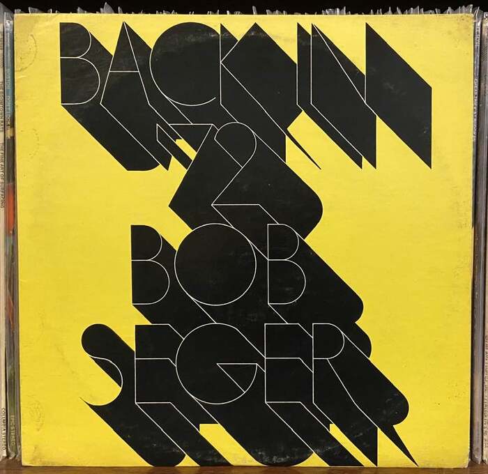


The cover forBob Seger’ssixth studio album,Back in ’72(1973), uses hairline lettering based onFutura, embellished by a long black shade. Chances are it’s inspired by PLINC’sFutura Fineline. It’s not a perfect match, though: compared toa 1971 specimen,AandCare narrower, the diagonals inKmeet in a point, and theSspine curves more. The music within—recorded at the legendaryMuscle Shoals Sound Studios—is a gritty blend of swampy rock and soul. This album contains the original studio version of“Turn the Page.”It was the first album released through Palladium Records (owned byPunch Andrews, Bob Seger’s manager), a division ofReprise Records.
The ultra-thin Futura Fineline creates a paradoxical brand energy of sophisticated restraint with underground edge. Its geometric skeleton maintains the rational precision of constructed letterforms, but the hairline weight transforms this into something almost fragile yet defiant—like a whispered rebellion. The theatrical black shadow adds analog warmth to the cold geometry, creating a duality between studio precision and street authenticity that perfectly captures Seger's position between mainstream craft and roots rebellion.
Futura Fineline's geometric form model provides the constructed rationality needed for clear album identification, while its extreme hairline weight subverts expectations of rock typography. The minimal stroke contrast and closed apertures create editorial precision, but the near-invisible weight suggests vulnerability and intimacy—perfect for an artist known for introspective storytelling. The custom modifications (narrowed A and C, pointed K diagonals, curved S spine) show typographic sensitivity, tailoring the geometric skeleton to better serve the specific letter combinations in "SEGER" while maintaining structural cohesion.
This is a single-font solution that creates hierarchy through dramatic shadow treatment rather than weight variation. The pairing exists between the hairline letterforms and their bold shadow—a brilliant contrast strategy that maintains geometric consistency while adding visual weight and analog character. This approach avoids the typical rock cliché of heavy, aggressive lettering, instead using restraint as the bold move, where the whisper-thin type becomes memorable precisely because it defies genre expectations.