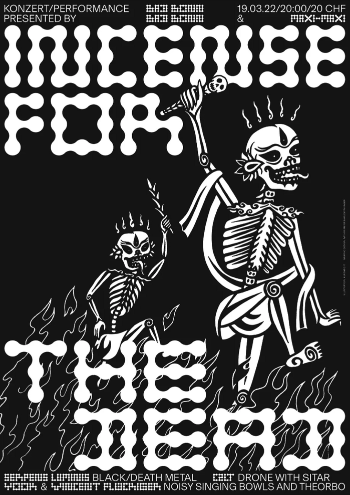


Poster for a heavy metal concert and performance event atBad Bonn, in collaboration withNathan Meyer. The aim was to design a poster that was coherent with the event, while subverting common heavy metal clichés. To provide a contrast to the handcrafted feel of the linocut, theMetaballstypeface byMaxitypeintroduces more geometric forms, subtly referencing the bone motif of the illustration. The F4 poster was printed in a black only version, and another 50 × 70 cm version is printed in offset silver and black with a matte varnish byCric Printin Fribourg. The concert was organised by Maxime Barras & Maxime Papaux, under the name Maxi-Maxi. To view this video please enable JavaScript, and consider upgrading to a web browser thatsupports HTML5 video
This typography creates an anti-establishment cultural energy that subverts heavy metal clichés through deliberate restraint. Basel Grotesk's rational form model with its closed apertures and vertical stress provides editorial authority that legitimizes the underground event, while Metaballs' constructed geometric forms echo the skeletal motifs through modular, bone-like letterforms that feel both organic and systematically designed.
Basel Grotesk's rational grotesk structure provides necessary legibility and cultural credibility for concert information, while its tight apertures and minimal contrast create density that works against busy linocut backgrounds. Metaballs' geometric construction with its modular, skeletal character directly references the bone illustration motifs while maintaining readability in display applications—the typeface's systematic approach to letter construction mirrors anatomical structure without resorting to obvious death metal tropes.
This pairing works through deliberate contrast across form models—Basel's rational authority against Metaballs' geometric playfulness—creating visual hierarchy through structural differentiation rather than weight alone. The fonts share similar x-height proportions and stroke weights, providing cohesion, but their fundamentally different construction principles (rational vertical stress vs. geometric modularity) generate the tension needed for poster impact while maintaining sophisticated restraint.