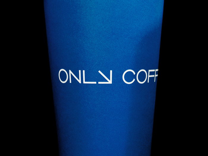
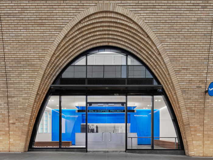


Only Coffee Projectis an Australian specialty coffee establishment in Sydney and Melbourne with a specific focus, an ever-evolving vision and an open brewing-laboratory setup. The business brews, serves and retails coffee exclusively, showcasing some of the best offerings from producers and roasters around the world. We were commissioned to develop a new visual identity to signal the coffee bar’s mathematical approach to brewing and to help it stand apart from Sydney’s crowded coffee landscape. The visual concept emerges directly from the name – Only Coffee Project – which expresses an attitude of ongoing progression and a single, obsessive focus on coffee. We crafted the identity using custom-drawn letterforms and incorporated a distinctive letterYthat doubles as a universal visual device suggesting energy flow and direction. The brand colour blue is inspired by the phrase “blue-sky thinking” – an invitation to imagine and explore uncharted territory, provoking and stimulating innovation within the world of coffee. The bespoke logotype moves between states of stillness and energised flow, mirroring a calculated approach to brewing that electrifies the senses and produces mesmerising experiences. The identity has helped establish Only Coffee Project as a convergence point for coffee lovers and positions the business as a generative space – part laboratory, part community hub — that continuously connects people through a single product: coffee.
FK Grotesk communicates a systematic-yet-energetic rationality that perfectly mirrors Only Coffee Project's "mathematical approach to brewing." The rational form model with its closed apertures and vertical stress creates analytical precision, while the geometric clarity and extended weight range allows for dynamic visual flow states. This typography embodies focused intensity — not scattered creativity but laser-focused obsession channeled through clean, calculated forms.
FK Grotesk's rational-geometric hybrid structure serves the laboratory-meets-coffeehouse positioning brilliantly. The closed apertures and vertical stress axis establish scientific credibility and methodical precision, while the constructed geometric elements prevent it from feeling cold or sterile. The extensive weight range enables the "states of stillness and energized flow" described in the brief — lighter weights for analytical clarity, heavier weights for energetic emphasis. The systematic character set supports the mathematical brewing approach while remaining approachable for retail application.
As a single-font system, FK Grotesk creates hierarchy through weight and spacing variation rather than typographic contrast. The rational structure provides the stable foundation for the custom-drawn logotype elements, while the weight range allows movement between analytical precision (light weights for ingredient lists, brewing parameters) and energetic emphasis (bold weights for key messaging). This monotypographic approach reinforces the "only coffee" focus — one obsession, one systematic approach, one carefully chosen typeface.