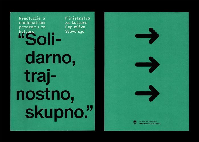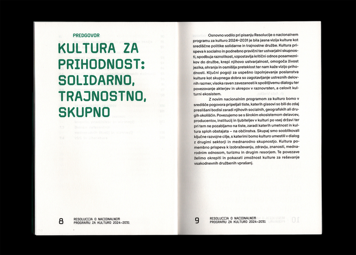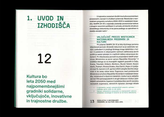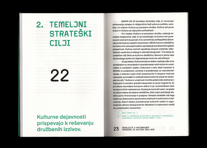


In 2024, the Ministry of Culture of Slovenia issued theResolution on the National Programme for Culture in Slovenia(Slovenian:Resolucija o nacionalnem programu za kulturo) for the period between 2024 and 2031. It is the main document outlining the program and development goals that the Ministry aims to achieve during this and possible future mandates.
ABC Oracle's high-contrast transitional forms with sharp serifs and tight apertures create institutional gravitas while maintaining scholarly readability—essential for a government cultural mandate spanning seven years. The pairing with Cubic 22's monospaced geometric precision adds bureaucratic authenticity, suggesting systematic documentation and democratic transparency through its typewriter-like uniformity.
Oracle's rational form model with vertical stress and closed apertures projects the editorial authority needed for state cultural policy, while its high contrast ensures legibility across dense governmental text. Cubic 22's geometric monospaced structure serves dual purposes: creating clear hierarchical separation from Oracle while evoking administrative tradition through its typewriter heritage, reinforcing the document's official status through familiar bureaucratic typography.
This pairing deliberately contrasts across form models—Oracle's rational editorial structure against Cubic 22's geometric systematic construction—yet maintains coherence through shared precision and institutional gravitas. The high contrast serif paired with monospaced geometric follows Kupferschmid's "risky but rewarding" different-form-models approach, working because both fonts carry bureaucratic DNA despite their structural differences, creating functional hierarchy through contrasting typographic philosophies.