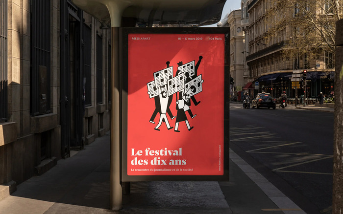
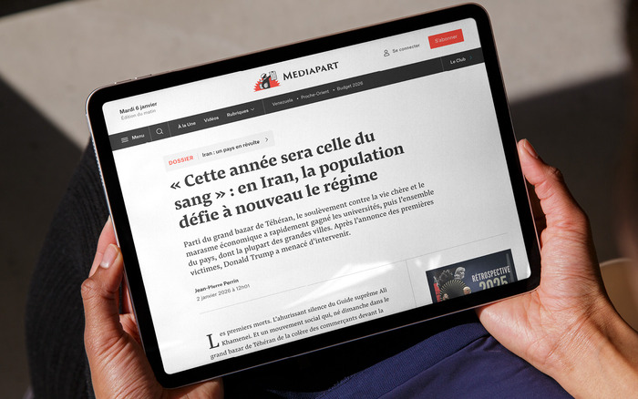
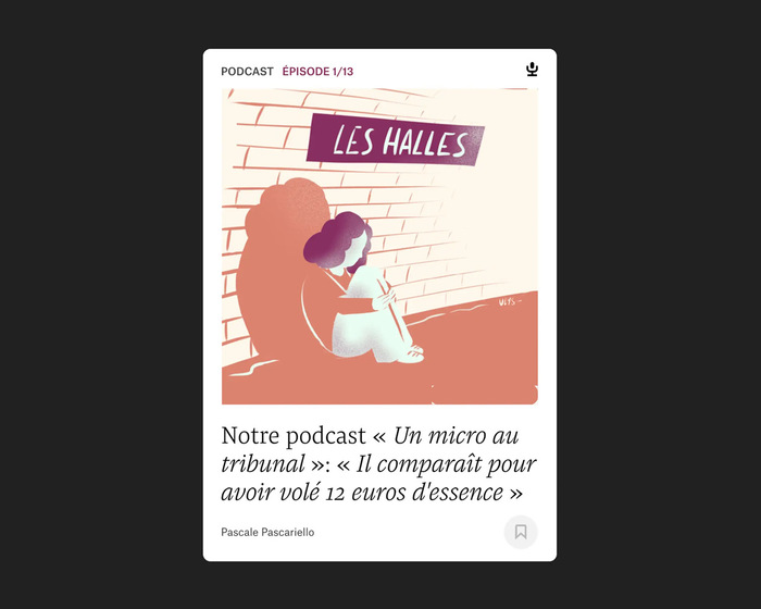
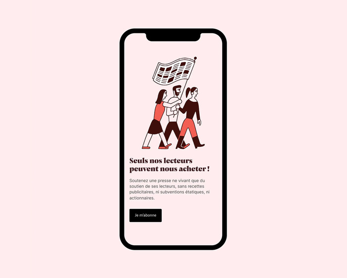
Mediapartis a French investigative online newspaper known for exposing numerous political and economic scandals. Its financing model is unique: funded exclusively through subscriptions,Mediapartreports independently without advertising influence. During the redesign of its website and mobile app bycmjnrvb studio, the visual identity was harmonized across editorial content, the user interface, and the subscriber area (theMediapart Club). A central challenge was differentiating these spaces while maintaining a coherent overall system. Pensum Prowas adopted for editorial content, supporting long-form reading with balanced proportions and excellent legibility.Pensum Displayprovides contrast and presence for special headlines. For the Mediapart Club and interface elements such as author names, dates, and metadata,Atlas Groteskestablishes a clear typographic hierarchy that distinguishes subscriber content from editorial material. Historically, Mediapart’s typographic wordmark was set in the seriffedTrajan. The redesign shifted to the sans-serif forms ofTrajan Sansto improve readability while preserving the essence of the original design. Theredesignalso included a refined logotype, a systematic color palette, and a consistent illustration style. These elements were compiled into a comprehensive graphic charter ensuring clarity, consistency, and flexibility across digital and print platforms.
This typography system communicates editorial gravitas with digital accessibility—a rational authority that doesn't intimidate. Pensum's dynamic form model brings humanistic warmth to investigative content through its open apertures and diagonal stress, while Atlas Grotesk's rational structure provides the clean, vertical precision needed for interface hierarchy. The combination creates intellectual credibility without the cold distance of purely rational forms.
Pensum Pro's dynamic characteristics—open counters, moderate contrast, and calligraphic roots—support extended reading while maintaining editorial seriousness through its transitional serif structure. Atlas Grotesk's rational form model with closed apertures and vertical stress creates clear informational hierarchy for metadata and interface elements. The shift from serif Trajan to Trajan Sans preserves brand equity while gaining the optical clarity needed for small-screen legibility, demonstrating strategic evolution rather than abandonment of brand heritage.
This pairing follows classic contrast-with-cohesion principles by mixing dynamic (Pensum) and rational (Atlas) form models while maintaining compatible proportions and x-heights. The serif-sans relationship creates natural hierarchy without relying solely on weight changes—the structural DNA differs enough to distinguish content types (editorial vs. interface) while sharing sufficient proportional harmony to feel systematic. The optical size strategy with Pensum Display adds sophistication through purpose-built forms rather than simple scaling.