
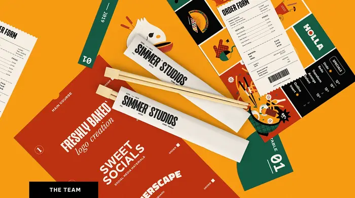
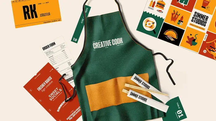
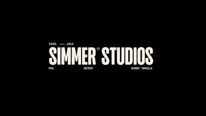
Simmer Studiosis a food-themed design studio based in Manila, Philippines, established by young and bright-minded individuals aiming to harness innovation through creativity. Around 2022, the creative firm usedRockidsfor their own identity andwebsite, alongsideBe Vietnam,Nord Display, andBaskervville, among others. In the meantime, Simmer Studios has rebranded with different fonts.
Simmer Studios' typography communicates playful creative confidence with a distinctly youthful, experimental energy. The combination of Rockids' quirky display character with the clean professionalism of Be Vietnam creates a "serious about fun" personality that suggests a studio that takes creativity seriously while maintaining an approachable, unpretentious demeanor. This typographic mix signals innovation without intimidation—perfect for a young Manila-based food design studio.
Rockids serves as the primary brand voice with its distinctive character forms and playful terminals, establishing immediate memorability and creative credibility. Be Vietnam provides the necessary professional backbone with its clean geometric structure and excellent screen readability, while Nord Display and Baskervville add textural variety for specific applications. The x-height consistency across the system ensures hierarchy works smoothly, while the contrast between Rockids' expressiveness and Be Vietnam's restraint creates dynamic visual tension.
This four-font system works through strategic contrast—Rockids provides the creative spark and brand personality, while Be Vietnam anchors the system with professional reliability. The pairing creates a perfect balance between "we're creative innovators" and "we're serious business partners," allowing the studio to flex between playful brand moments and credible professional communication. The additional display fonts expand the expressive range without overwhelming the core relationship.