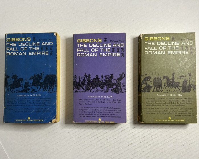
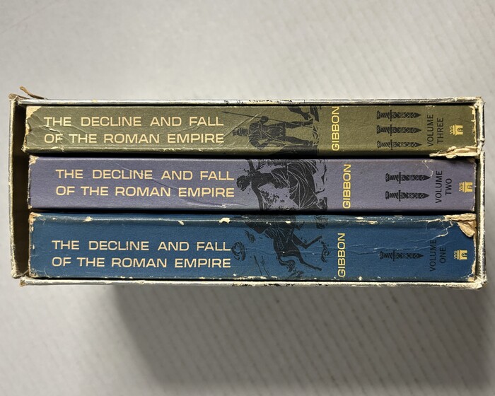
Written by Edward Gibbon in 1776–1789,The Decline and Fall of the Roman Empirehas been published in many editions. This Washington Square Press boxed set from 1962 is very America in the early ’60s: the colors, the informal illustration, and the type – a casual hand-drawn boxy sans with a subtle swelling at the ends,Microflair. Compare to the1970s Modern Library editionwhich also represents its time quite well.
This typography embodies accessible American intellectualism of the early 1960s - scholarly yet approachable, with the hand-drawn Microflair title font communicating unpretentious learning that invites rather than intimidates. The pairing suggests academic rigor made digestible for mass-market paperback consumption, balancing gravitas with mid-century optimism about popular education.
Century Expanded provides the classical foundation with its readable proportions and moderate contrast, appropriate for extended historical text. Microflair's hand-drawn sans serif with subtle stroke terminals creates warmth and accessibility - its boxy construction and slight swelling at stroke ends soften what could be austere academic subject matter. The contrast between formal text serif and casual display sans perfectly captures 1960s democratization of highbrow content.
The pairing creates productive tension between scholarly authority (Century Expanded) and approachable informality (Microflair). This hierarchy makes dense historical content feel accessible while maintaining credibility - the hand-drawn display font humanizes Gibbon's monumental work without diminishing its intellectual weight, perfectly suited to Washington Square Press's mission of quality paperbacks for general readers.