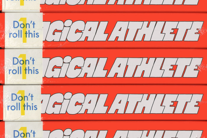
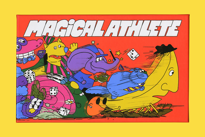
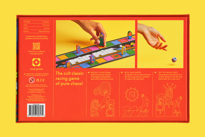
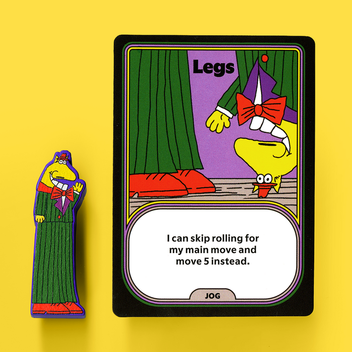
Magical Athleteis a chaotic racing game that’s fast, dumb, and without a doubt, the only game where you can race a baby versus a banana. The original version of the game, designed by Takashi Ishida in 2003, was beloved by serious gamers for its fantastic gameplay, but a bit lost when it came to aesthetic direction; not only was the board difficult to read, but it didn’t reflect the joyous energy of the game. For this new edition, the mechanisms of the game were expertly updated by Richard Garfield, game designer and creator ofMagic: The Gathering—but that still left a big question mark as to how the game should look and feel. To help evoke the simultaneously simple and wacky nature of the game, I decided to lean on simple shapes and primary colors for the graphic design. Our team knew from the start that the game had to be profusely illustrated, and our interest in 1970s illustration likeRichard Hefter’sShufflebookandSweet Picklesseries,Heinz Edelmann’s work forThe Beatles’Yellow Submarine, andPeter Max’s psychedelic color, led us to work with the exceptionalAngela Kirkwoodon the artwork. The game is predominantly set inGrilli Type’sFlaire. Its “Extra” and “Basic” variations meant we could dial up pizazz when needed, as on the character names on cards, while also relying on the Basic as a heavy-lifting sans serif in spots with dense amounts of text like the rulebook. The external box follows the system devised bySMLXL, which exclusively uses the book weight ofLineto’sSupreme. The logo and board typography is hand-lettered by illustrator Angela Kirkwood.
This typography system radiates chaotic joy and nostalgic whimsy through its strategic contrast between Grilli Type's Flaire's rounded, friendly geometry and hand-lettered custom elements. The pairing creates an energy that's simultaneously sophisticated and playfully unhinged, perfectly capturing the 'fast, dumb' racing game aesthetic while maintaining readability across complex game components.
Flaire's generous x-height and rounded terminals provide exceptional readability for dense rulebook text while its 'Extra' weight delivers the visual punch needed for character names and key information. The sans serif's geometric foundation offers structural clarity essential for game mechanics, while its softer edges prevent the sterility that could kill the fun factor. The hand-lettered logo elements add organic chaos that perfectly complements Flaire's controlled friendliness.
The three-tier typographic hierarchy brilliantly balances control and chaos: Supreme's refined book weight on packaging creates premium shelf presence, Flaire's weight range handles the functional heavy-lifting with personality, and Kirkwood's hand-lettering injects pure creative energy where maximum impact is needed. This system creates visual breathing room between corporate polish and artistic wildness.